

The react-bootstrap library provides a Modal Component for adding dialogs to our web application to notify users, obtain user permission, or display important information.
React Bootstrap Modal provides dialogs for our application, user notifications, or custom content.
Here is the step-by-step guide to integrating a bootstrap modal in React, use react-bootstrap and bootstrap libraries.
Step 1: Create a React Project
Use the Vite template to create a React project using this command:
npm create vite@latest new-react-app -- --template react
It will create a new-react-app project folder.
Go inside the directory and install the dependencies:
cd new-react-app

npm install
After installing, type the below command to start a development server:
npm run dev
Step 2: Install Bootstrap and react-bootstrap libraries
Type the following command:
npm install react-bootstrap bootstrap --save
Import the bootstrap.min.css file in src/main.jsx file:
import React from "react";
import ReactDOM from "react-dom/client";

import App from "./App.jsx";
import 'bootstrap/dist/css/bootstrap.min.css';

ReactDOM.createRoot(document.getElementById("root")).render(
  <React.StrictMode>
    <App />
  </React.StrictMode>
);
Step 3: Creating a Modal
The src/App.jsx is our main component file, and to create a Bootstrap Modal, we need to import these components to this file.
Here is the App.jsx file:
import { useState } from "react";
import { Modal, Button } from "react-bootstrap";
const App = () => {
const [show, setShow] = useState(false);
const handleClose = () => setShow(false);
const handleShow = () => setShow(true);
return (
<>
<Button
variant="primary"
onClick={handleShow}
style={{ marginLeft: 100, marginTop: 100 }}
>
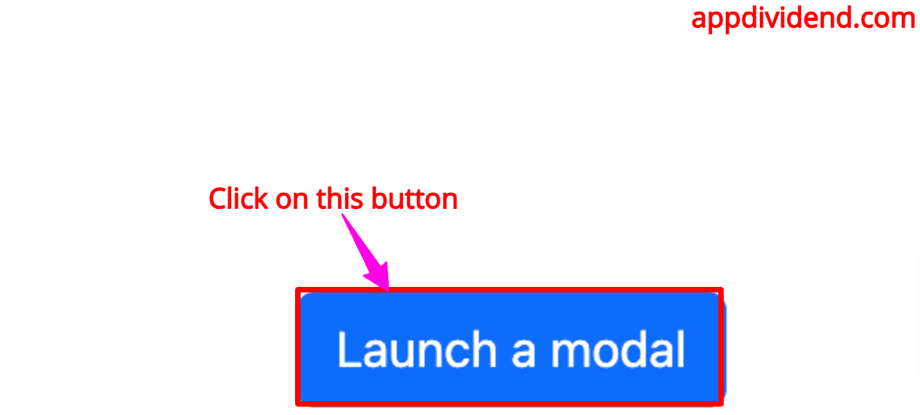
Launch a modal
</Button>
<Modal show={show} onHide={handleClose}>
<Modal.Header closeButton>
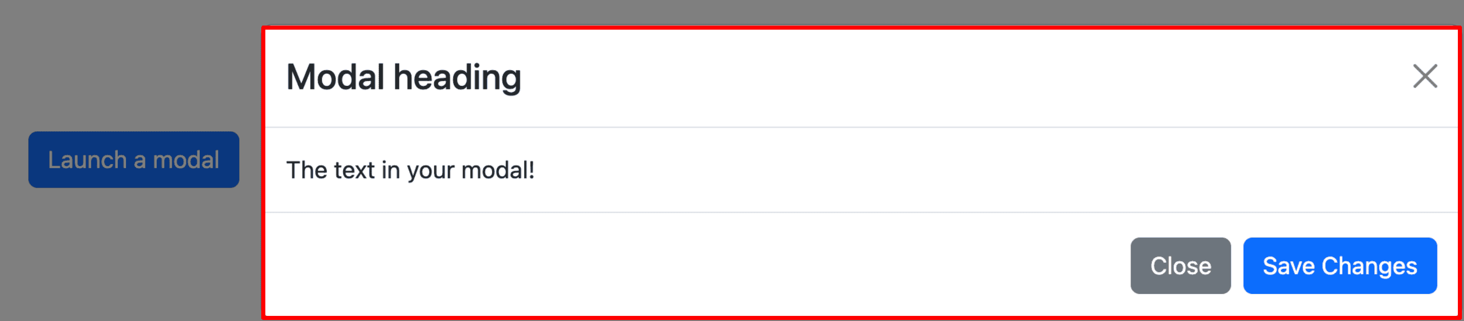
<Modal.Title>Modal heading</Modal.Title>
</Modal.Header>
<Modal.Body>The text in your modal! </Modal.Body>
<Modal.Footer>
<Button variant="secondary" onClick={handleClose}>
Close
</Button>
<Button variant="primary" onClick={handleClose}>
Save Changes
</Button>
</Modal.Footer>
</Modal>
</>
);
};
export default App;
In this code, we first imported the useState hook to update the state variables.
Then, we imported the Modal and Button components from the “react-bootstrap” library.
In the next step, we defined a functional component, App, our main component for displaying everything.
Inside our functional component, we defined a state variable show. This variable is responsible for showing and closing a modal dialog box. Initially, we set its value to false.
Then, we defined two functions:
- handleClose(): It will set the “show” variable to false.
- handleShow(): It will set the “show” variable to true.
So, when we click on the Button component, we update the “show” state to true, which displays the modal.
If you click the “close” button, the modal closes because it triggers the handleClose() method.
The <Modal> component has an onHide property that accepts a handleClose() function.
Save this file and make sure that your server is running and go to this URL: http://localhost:5173/
If you launch a modal, it will show like this:
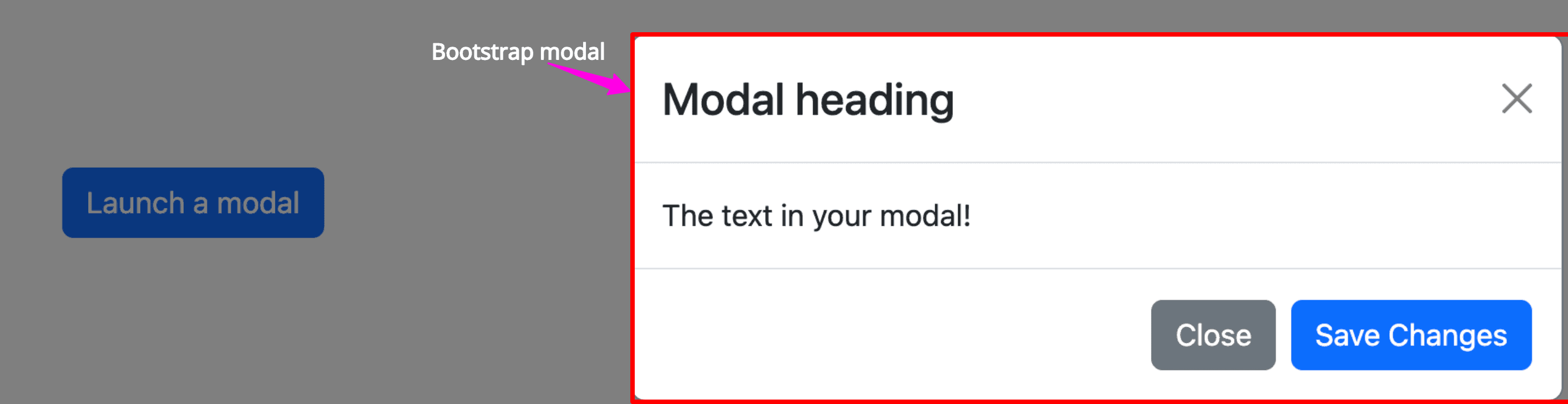
This is just a basic bootstrap modal.
Props in Modal Component
animation
If you pass the animation={true} property to the <Modal> component, then it enables the fading transition effect for opening and closing the dialog.
<Modal show={show} onHide={handleClose} animation={true}>
If you don’t want animation, then you can pass animation = {false}.
autoFocus
This property automatically focuses on the modal when it opens.
<Modal show={show} autoFocus={true}>
backdrop
The backdrop controls whether the modal can be closed by clicking anywhere on the screen.
The value of backdrop control can be static, true, or false.
<Modal show={show} backdrop="static">
centered
This property centers the modal vertically in the viewport.
<Modal show={show} centered>
aria-labelledby
It provides an ID for the label of the moda to enhance accessibility.
<Modal show={show} aria-labelledby="modalLabelId">
dialogAs
It provides a way to import custom modal component that can be used for modal dialog.
<Modal show={show} dialogAs={CustomDialogComponent}>
manager
You can use the custom modal manager to handle the modal stack.
<Modal show={show} manager={new ModalManager()}>
onHide
The onHide property is a callback function called when the modal is requested to be hidden (not necessarily fully closed yet).
<Modal show={show} onHide={handleClose}>
scrollable
This property allows the modal body to scroll independently of the page.
<Modal show={show} scrollable={true}>
size
You can modify the size of a modal by providing different values to this property.
- To create a large-size modal, pass size = “lg”.
- To create a small size modal, pass size = “sm”.
- To create a medium-size modal, pass size = “md”.
<Modal show={show} size="lg">
Let’s create a small-size modal using this command:

For more information about Modal properties, check out official docs.

Jürgen Schatral
Hi, very good, but if I start the frontend I get a “TypeError: Cannot read property ‘apply’ of undefined” Stack enters with “const store createStore”. If need information about the circumstances we can talk you get my e-mail – Thank you. I work with Visual Studio Code and Chrome. Backend runs without a problem…
I hope that is only an individual fault because of my configuration..
Thank you – Greetings from Germany – J.Schatral
John Ayers
Hello,
I tried this example but when I click on the React Modal button, the pop up shows up at the corner of the page. Any suggestions to make the popup overlay they at the center of the page the way a modal pop up should work?
victor reyes
it’s better
handleChange = e => this.setState({[e.target.name]: e.target.value})
and