
You can use the “react-select” library with “Material UI components” to create a fully functional dropdown menu using Material React.js.
Here is the step-by-step guide:
Step 1: Create a React.js project using Vite
Let’s create a basic React.js boilerplate using Vite by the following command:
npm create vite@latest dropdown-app -- --template react
It will create a React project folder called “dropdown”.
Go inside a project folder and install the dependencies:
cd dropdown-app

npm install
Step 2: Install react-select and Material UI
You can install the react-select and Material UI libraries using this command:
npm install @mui/material @emotion/react @emotion/styled react-select --save
Step 3: Import the libraries and define the options
Replace the below code inside src/App.jsx file:
import React, { useState } from 'react';
import { Typography, Box } from '@mui/material';
import Select from 'react-select';

const programmingLanguages = [
  { label: 'Python', value: 1 },
  { label: 'JavaScript', value: 2 },
  { label: 'PHP', value: 3 },
  { label: 'Go', value: 4 },
  { label: 'Rust', value: 5 },
  { label: 'Dart', value: 6 },
  { label: 'Ruby', value: 7 },
];
In this code, we imported the React library and useState hook.
The useState hook is used to manage the state of selected items.
The Typography Material UI component is used for text styling, and Box provides a container with built-in layout properties.
The “react-select” library is also imported, which is used to create dropdowns.
Step 4: Write a functional component App()
Here is the complete code for the App.jsx file:
// App.jsx

import React, { useState } from 'react';
import { Typography, Box } from '@mui/material';
import Select from 'react-select';

const programmingLanguages = [
  { label: 'Python', value: 1 },
  { label: 'JavaScript', value: 2 },
  { label: 'PHP', value: 3 },
  { label: 'Go', value: 4 },
  { label: 'Rust', value: 5 },
  { label: 'Dart', value: 6 },
  { label: 'Ruby', value: 7 },
];

const App = () => {
  const [selected, setSelected] = useState([]);

  const handleChange = (selectedOptions) => {
    setSelected(selectedOptions || []);
  };

  return (
    <Box display="flex" flexDirection="column" alignItems="center">
      <Typography variant="h5" gutterBottom>
        Pick Programming Languages:
      </Typography>
      <Box width="650px" mb={2}>
        <Select
          options={programmingLanguages}
          value={selected}
          onChange={handleChange}
          isMulti
          placeholder="Select languages"
        />
      </Box>
      {selected.length > 0 && (
        <Box mt={1}>
          <Typography variant="body1">
            Selected: {selected.map((option) => option.label).join(', ')}
          </Typography>
        </Box>
      )}
    </Box>
  );
};

export default App;
We created an App.jsx functional component representing an entire application.
In the above code, we used the “useState()” function to initialize the “selected” state variable as an empty array. This array will store the option values from the dropdown.
The handleChange() function is triggered when the dropdown value is changed.
Then, we displayed the dropdown menu and selected items in a string format.
Save the file and start the Vite development server using this command:
npm run dev
It will start the server using this command: http://localhost:5173/

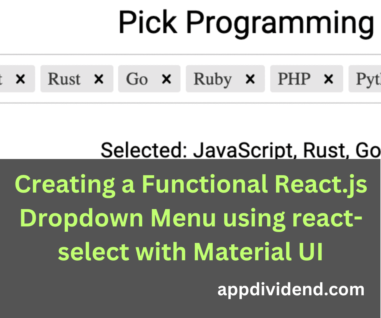
The output shows that we selected multiple options, converted the selected values to command-separated values, and displayed them.
