Imagine creating a web application that requires users to input data via forms. Angular comes with ReactiveModule, which provides an easy and streamlined way to manage forms.
Reactive Forms in Angular quickly offers complex forms, ensuring solid data binding and form validation.
If you want form validation and reactivity to vital user input, you require the FormControl class, which we learn in this tutorial.
This guide explains FormControl and how to create, validate, and integrate it with other form elements.
What is Angular FormControl?
Angular FormControl is a built-in class that tracks an individual form control’s value and validation status. It is used to get and set values and validate the form control fields like <input> or <select>. It can be used standalone or in a parent form.
FormControl is one of the three fundamental building blocks of Angular forms, along with FormGroup and FormArray. It extends the AbstractControl class, which implements most of the base functionality for accessing the value, validation status, user interactions, and events.
If you are confused with FormControl, FormGroup, FormArray, and Validators classes, this article will help you understand how they can work together to build excellent angular forms.
We need to create an instance of FormControl in our class for every form control, such as a text box, checkbox, or radio button.
For example, we need to create an instance of the name field.
name = new FormControl();
In our HTML template, you can use the following code.
<input [formControl]="name">
Why do we need FormControl?
- Value Tracking: One of FormControl’s main advantages is the ability to track the current value of the form input.
- Validation: The FormControl class attaches validators (both synchronous and asynchronous) to a form input. It ensures the data meets specific criteria and prevents submitting a form.
- Status Management: The FormControl class tracks the status of the form input (valid, invalid, pristine, dirty, touched, untouched).
- Reactivity: FormControl provides reactive capabilities, meaning you can subscribe to value and status changes and react accordingly.
What is a FormGroup in Angular?
FormGroup is a wrapper for a collection of form controls. It gives you the same access to the state of the wrapped controls.
FormGroup is used with FormControl to track the value and validate the form control state.
Why do we need FormGroup?
FormControl manages multiple FormControls as a unit. It helps logically group multiple-form controls. It allows complex forms with multiple sections.
You can apply validators to the group as a whole, which is helpful for cross-field validation.
Creating a FormControl
There are two ways to create a FormControl:
- Individual FormControl
- As a part of FormGroup
Creating an Individual FormControl
You can create an individual FormControl by instantiating it in your src/app/app.component.ts file like this:
import { Component } from '@angular/core';
import { FormControl } from '@angular/forms';

@Component({
  selector: 'app-root',
  template: `
    <div>
      <label for="name">Name:</label>
      <input id="name" [formControl]="nameControl">
      <p *ngIf="nameControl.invalid && nameControl.touched">Name is required.</p>
    </div>
  `
})
export class AppComponent {
  nameControl = new FormControl('');
}
Creating as a part of FormGroup
If you are working with multiple FormControls, grouping them using a FormGroup is common.
Add the below inside src/app/app.component.ts file:
import { Component } from '@angular/core';
import { FormGroup, FormControl } from '@angular/forms';

@Component({
  selector: 'app-root',
  template: `
    <form [formGroup]="form">
      <label for="name">Name:</label>
      <input id="name" formControlName="name">
      <p *ngIf="form.get('name').invalid && form.get('name').touched">Name is required.</p>

      <label for="email">Email:</label>
      <input id="email" formControlName="email">
      <p *ngIf="form.get('email').invalid && form.get('email').touched">Email is required.</p>

      <button type="submit" [disabled]="form.invalid">Submit</button>
    </form>
  `
})

export class AppComponent {
  form = new FormGroup({
    name: new FormControl(''),
    email: new FormControl(''),
  });
}
In this code, we created a new FormGroup with two FormControls: name and email.
How to add a FormControl to a FormGroup?
Here are five methods to add or delete FormControl in FormGroup in Angular:
- addControl(): The addControl() method adds a control and updates its value and validity.
- removeControl(): The removeControl() method removes a control.
- setControl(): The setControl() method replaces an existing control.
- contains(): The contains() method checks for enabled controls associated with a given name
- registerControl(): The registerControl() method registers a control but does not update its value and validity, unlike the other methods.
Here is the step-by-step guide to illustrating the combined usage of FormControl and FormGroup:
Step 1: Setup an Angular Project
You can create a new Angular project using the below command:
ng new control-app
Go inside the project.
cd control-app
Step 2: Install Angular Material
For styling, we will use the Angular Material. Let’s install Angular material using the below command:
ng add @angular/material
Step 3: Import Angular Material Modules
Open the src/app/app.component.ts file and add the below code:
import { Component } from '@angular/core';
import { MatInputModule } from '@angular/material/input';
import { MatButtonModule } from '@angular/material/button';
import { MatCardModule } from '@angular/material/card';
import { MatFormFieldModule } from '@angular/material/form-field';

@Component({
  selector: 'app-root',
  templateUrl: './app.component.html',
  styleUrls: ['./app.component.css'],
  standalone: true,
  imports: [
    MatInputModule,
    MatButtonModule,
    MatCardModule,
    MatFormFieldModule
],
})
export class AppComponent {

}
We imported MatInputModule, MatButtonModule, MatCardModule, and MatFormFieldModule in this code.
- The MatInputModule helps in creating a card layout for the form.
- The MatFormField is a wrapper for the input fields with enhanced styling.
- The MatInput is a Material-styled input field.
- The MatButton module provides styled buttons for form actions.
Step 4: Registering form groups
We will add two form fields for this signup form: email and name.
Let’s create a FormControl for each form field and group them using FormGroup.
Update the src/app/app.component.ts file with the below code:
import { Component } from '@angular/core';
import { FormControl, FormGroup, ReactiveFormsModule } from '@angular/forms';
import { MatInputModule } from '@angular/material/input';
import { MatButtonModule } from '@angular/material/button';
import { MatCardModule } from '@angular/material/card';
import { MatFormFieldModule } from '@angular/material/form-field';

@Component({
  selector: 'app-root',
  templateUrl: './app.component.html',
  styleUrls: ['./app.component.css'],
  standalone: true,
  imports: [
    ReactiveFormsModule,
    MatInputModule,
    MatButtonModule,
    MatCardModule,
    MatFormFieldModule,
  ],
})
export class AppComponent {
  form = new FormGroup({
    name: new FormControl(''),
    email: new FormControl(''),
  });
}
You can see that first, we imported FormControl, FormGroup, and ReactiveFormsModule from @angular/forms.
Inside the class AppComponent, we created a new FormGroup instance where we passed two FormControls for each form field.
Add the below code inside the src/app/app.component.html file:
<form [formGroup]="form" class="signup-form">
  <mat-card class="signup-card">
    <mat-card-header>
      <mat-card-title>Signup Form</mat-card-title>
    </mat-card-header>
    <mat-card-content>
      <mat-form-field appearance="fill" class="full-width">
        <mat-label>Name</mat-label>
        <input matInput formControlName="name" />
      </mat-form-field>

      <mat-form-field appearance="fill" class="full-width">
        <mat-label>Email</mat-label>
        <input matInput formControlName="email" />
      </mat-form-field>

      <div class="form-actions">
        <button
          mat-raised-button
          color="primary"
          type="submit"
          [disabled]="form.invalid"
        >
          Submit
        </button>
        <button
          mat-raised-button
          color="accent"
          type="reset"
          (click)="form.reset()"
        >
          Reset
        </button>
      </div>
    </mat-card-content>
  </mat-card>
</form>
Also, add the CSS inside the src/app/app.component.css file:
.signup-form {
  display: flex;
  justify-content: center;
  align-items: center;
  height: 100vh;
  background-color: #f5f5f5;
}

.signup-card {
  width: 500px;
  padding: 20px;
}

.full-width {
  width: 100%;
}

.form-actions {
  display: flex;
  justify-content: space-between;
  margin-top: 20px;
}
Save this file and start the development server using this command:
ng serve --open
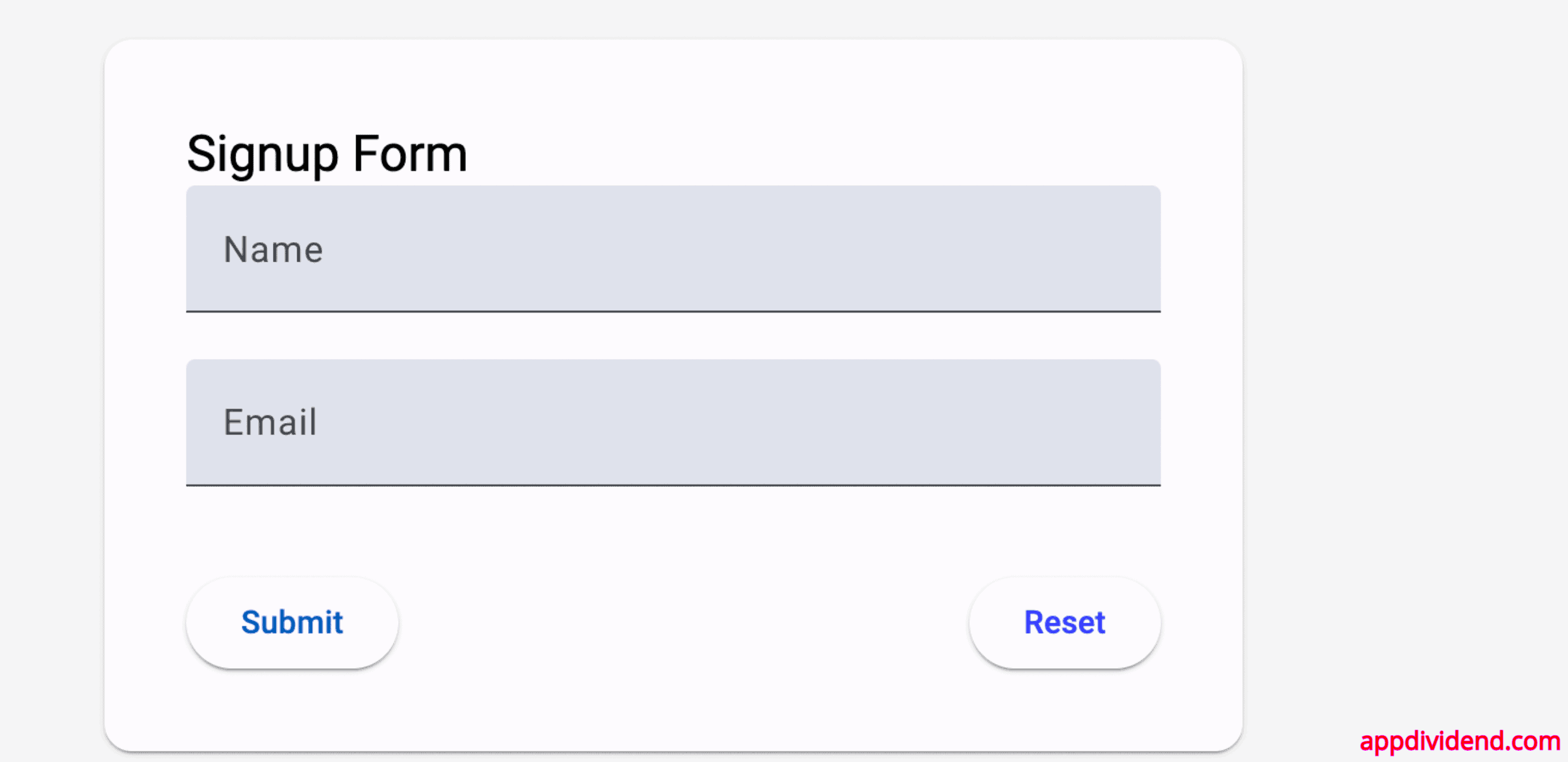
Your basic web form looks like this:
Step 5: Adding Validation
Angular provides several built-in validators, such as required, minLength, and pattern, that we can use to validate input fields.
To work with validation, import the Validators class from the @angular/forms module.
Update the src/app/app.component.ts file with the below code:
import { Component } from '@angular/core';
import { FormControl, FormGroup, Validators } from '@angular/forms';
import { ReactiveFormsModule } from '@angular/forms';
import { MatInputModule } from '@angular/material/input';
import { MatButtonModule } from '@angular/material/button';
import { MatCardModule } from '@angular/material/card';
import { MatFormFieldModule } from '@angular/material/form-field';

@Component({
  selector: 'app-root',
  templateUrl: './app.component.html',
  styleUrls: ['./app.component.css'],
  standalone: true,
  imports: [
    ReactiveFormsModule,
    MatInputModule,
    MatButtonModule,
    MatCardModule,
    MatFormFieldModule,
  ],
})
export class AppComponent {
  form = new FormGroup({
    name: new FormControl('', Validators.required),
    email: new FormControl('', [Validators.required, Validators.email]),
  });
}
Here, we added validation conditions like form fields are required and email field should only accept email.
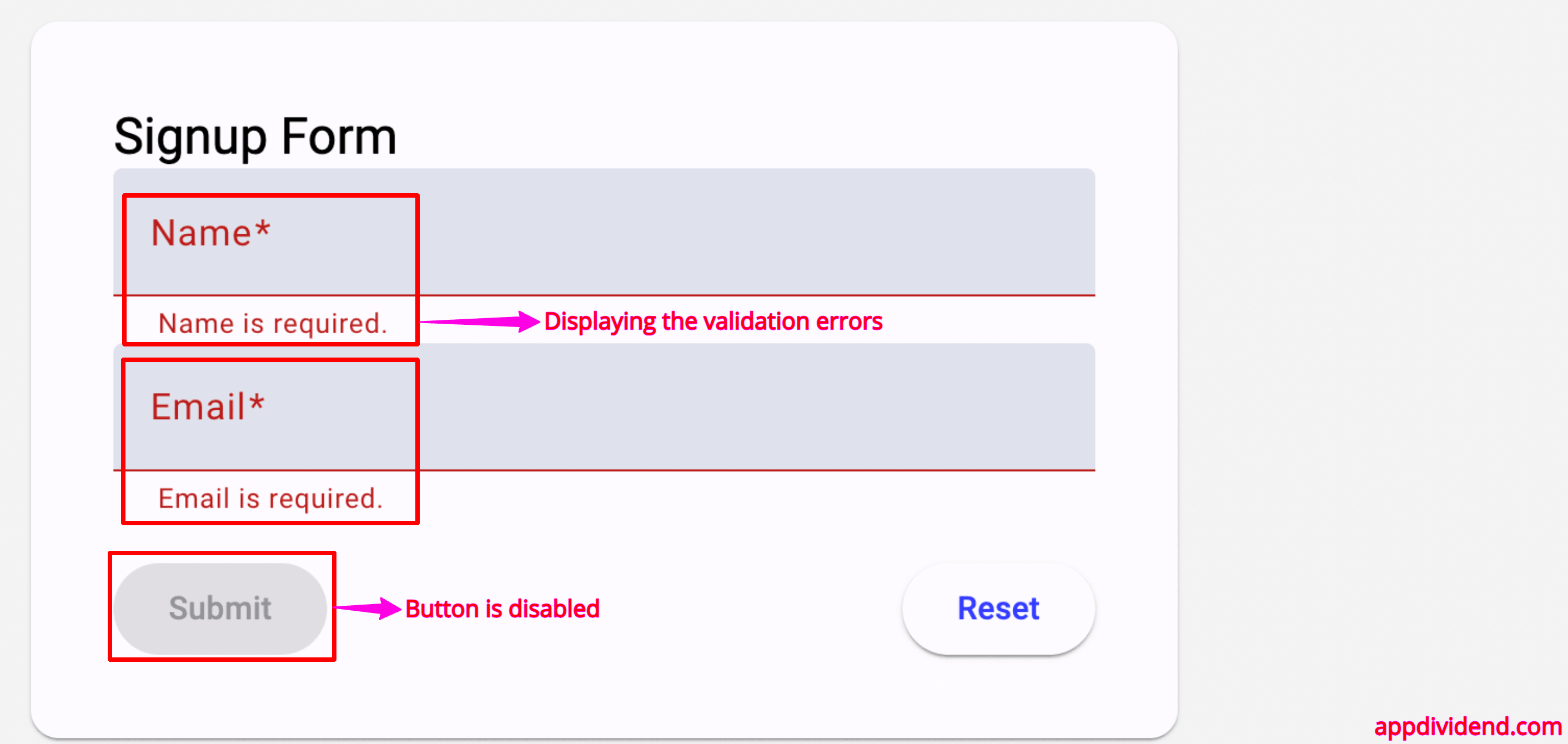
Our final step is to display the validation errors to the user and disable the submit button unless we pass each validation.
<form [formGroup]="form" class="signup-form">
  <mat-card class="signup-card">
    <mat-card-header>
      <mat-card-title>Signup Form</mat-card-title>
    </mat-card-header>
    <mat-card-content>
      <mat-form-field appearance="fill" class="full-width">
        <mat-label>Name</mat-label>
        <input matInput formControlName="name" />
        @if (form.get('name')?.invalid && form.get('name')?.touched) {
        <mat-error> Name is required. </mat-error>
        }
      </mat-form-field>

      <mat-form-field appearance="fill" class="full-width">
        <mat-label>Email</mat-label>
        <input matInput formControlName="email" />
        @if (form.get('email')?.invalid && form.get('email')?.touched) {
        <mat-error> Email is required. </mat-error>
        }
      </mat-form-field>

      <div class="form-actions">
        <button
          mat-raised-button
          color="primary"
          type="submit"
          [disabled]="form.invalid"
        >
          Submit
        </button>
        <button
          mat-raised-button
          color="accent"
          type="reset"
          (click)="form.reset()"
        >
          Reset
        </button>
      </div>
    </mat-card-content>
  </mat-card>
</form>
Save this file, go to the browser, and see if we are getting the validation message:
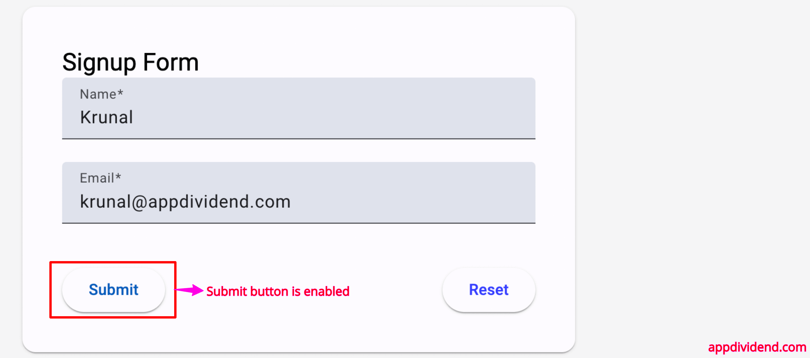
If you fill the input fields correctly, the validation error will go away, and the submit button will be enabled like this:
In this code, we are doing this: until the form fields have valid input, it will display the error.
We control the Form Input using the FormControl class and guard the fields using validation.
Conclusion
Understanding FormControl helps you manage form inputs and validations in Angular’s reactive forms.
You can leverage built-in validators and integrate FormControl within FormGroup; you can create dynamic and robust forms.
Try implementing FormControl in your projects to manage user input more effectively. Experiment with different form fields.


