

Form validation is a crucial aspect of web development. Validation messages provide feedback to users on what is wrong with input values.
To validate the form created with Material UI, we will use the Formik and Yup libraries.
We are using Formik for form state management and Yup for schema-based validation, simplifying form validation and error handling in React.
Here is the step-by-step guide:
Step 1: Setup React Project
In 2024, the best way to create a React.js project is to use the Vite frontend builder.
Type the following command to create a boilerplate:
npm create vite@latest validate-app -- --template react
After creating a new project folder, “validate-app”, go inside that folder:
cd validate-app
Install the React dependencies using the below command:
npm install
It will install all the project-related dependencies.
Step 2: Installing Material UI
Install Material UI and related dependencies using the below command:
npm install @mui/material @emotion/react @emotion/styled
Modify the src/main.jsx code like this:
// main.jsx

import React from "react";
import ReactDOM from "react-dom/client";
import App from "./App.jsx";

ReactDOM.createRoot(document.getElementById("root")).render(
  <React.StrictMode>
    <App />
  </React.StrictMode>
);
Step 3: Installing Formik and Yup
First, install Formik and Yup using the below command:
npm install formik yup
We will create a simple Signup form which contains the following three fields:
- username
- password
Our next step is to define a validation schema for these fields.
Step 4: Define a validation schema
Create a new file called validateSchema.js inside the src folder and add the below code:
import * as Yup from 'yup';

export const validationSchema = Yup.object({
    username: Yup.string().required('Username is required'),
    email: Yup.string().email('Invalid email address').required('Email is required'),
    password: Yup.string().min(6, 'Password must be at least 6 characters long').required('Password is required'),
});
Here, we defined validation rules for each form field.
Step 5: Creating a FormField Component Handling Errors
Our strategy is to create a reusable form component for rendering form fields.
Create a new file called FormField.jsx in the src and add the below code:
/* eslint-disable react/prop-types */

import { Field, ErrorMessage, useFormikContext } from "formik";
import { TextField } from "@mui/material";

const FormField = ({ label, name, type = "text" }) => {
  const { touched, errors } = useFormikContext();

  return (
    <Field
      as={TextField}
      label={label}
      name={name}
      type={type}
      fullWidth
      margin="normal"
      error={touched[name] && !!errors[name]}
      helperText={<ErrorMessage name={name} />}
    />
  );
};

export default FormField;
In this code, we imported two components, Field and ErrorMessage, and one hook, useFormikContext , from the Formik library.
- The Field component is responsible for connecting input fields to the form state.
- The ErrorMessage component displays validation error messages for a specific field.
- The useFormikContext hook gives access to the form context, including form state and helpers. It retrieves touched and errors objects.
We also imported TextField from Material UI.
The FormField component accepts three props:
- label: It is a label for an input field.
- name: It is a name of an input field.
- type: It is a type of attribute which can be a text, textarea, file, radio button, etc.
The FormField component returns the Field component from Formik, which uses the TextField component from Material UI.
Step 6: Use the FormField component
We created a FormField component but have not included it in our main App.jsx component.
Let’s update the src/App.jsx file and import FormField.jsx component like this:
// App.jsx

import { Formik, Form } from "formik";
import { Button, Box } from "@mui/material";
import FormField from "./FormField";
import { validationSchema } from "./validationSchema";

const App = () => (
  <Formik
    initialValues={{ username: "", email: "", password: "" }}
    validationSchema={validationSchema}
    onSubmit={(values) => {
      console.log("Form submitted", values);
    }}
  >
    {({ isValid }) => (
      <Form>
        <Box sx={{ mt: 2 }}>
          <FormField label="Username" name="username" />
          <FormField label="Email" name="email" />
          <FormField label="Password" name="password" type="password" />
          <Button
            type="submit"
            variant="contained"
            color="primary"
            sx={{ mt: 2 }}
            disabled={!isValid}
          >
            Submit
          </Button>
        </Box>
      </Form>
    )}
  </Formik>
);

export default App;
Step 7: Run the project
Save this file and start the development server using this command:
npm run dev
Go to this URL: http://localhost:5173/

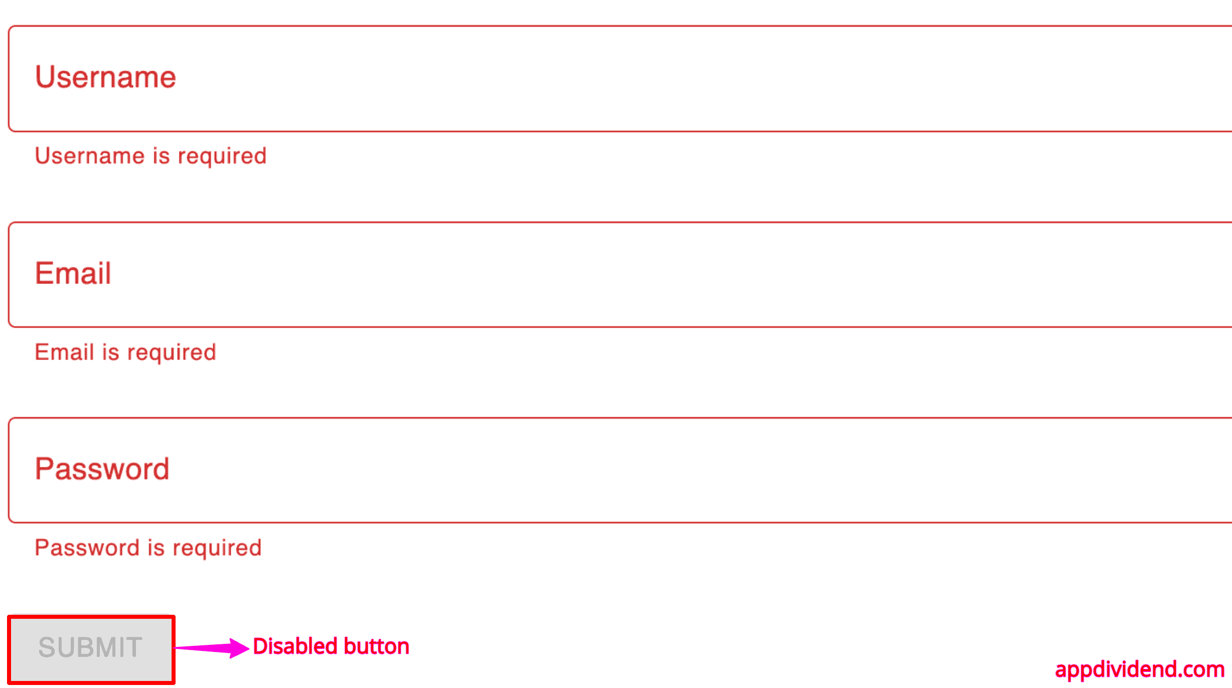
If you click on the submit button, you will see the validation messages like the below image:
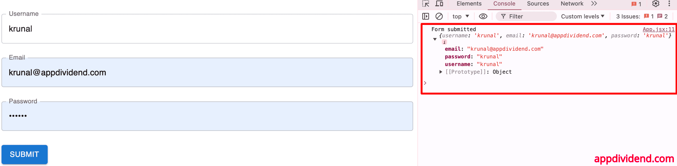
If you fill in the correct form values, the errors will be gone, the button will be enabled, and you can log the form values in the console like this:
Conclusion
Combining React.js with Formik and Yup libraries is not easy; you are also using the Material library. But if you make your code more modular, you can combine all the libraries and make your forms work amazingly.
React.js does not, by default, provide a validation mechanism, but you can use the Formik and yup libraries to add validation and display error messages.
In this code example, we used just TextField, but you can use any input type from the material library and create a fantastic form with proper validation.
