

A multi-step form is a UI component that breaks down complex or large forms into small, manageable steps or sections. Each step collects a subset of the required information, allowing users to complete the form sequentially.
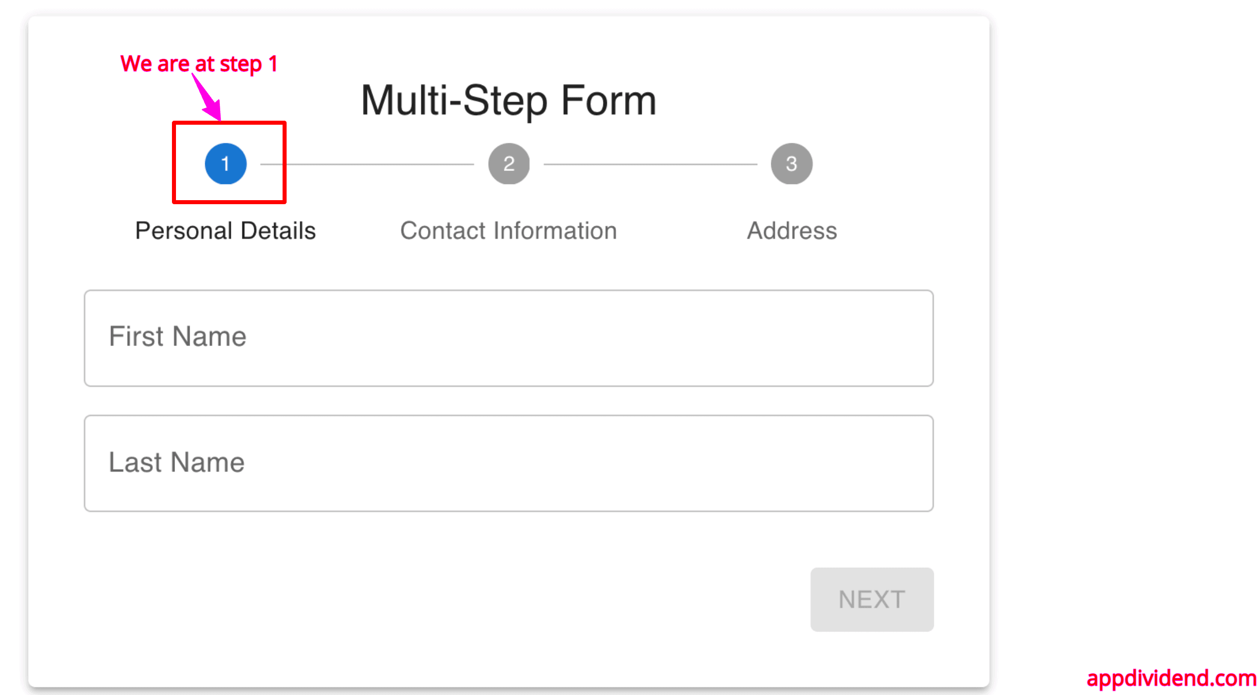
The multi-step form provides step-by-step navigation with progress indicators so the user can see where he stands in the form submission process like the below image:
In this article, we will cover the step-by-step guide to creating a multi-step form using React, Material UI and its Stepper Component, Formik, and Yup for form validation. We will keep our code modular for reusability and performance efficiency.
I have already written a basic guide on how to use Formik and Yup to create form validation in React.
Here is the step-by-step guide to creating a multi-step form:
Step 1: Setup a React project
You can create a new React project using the below command:
npm create vite@latest
Create a new project folder called “step-form-app” and go inside the folder:
cd step-form-app
Install the necessary dependencies using the below command:
npm install
Step 2: Installing Material UI, Formik, and Yup
We use Material UI, so we must install that library and related modules.
npm install @mui/material @emotion/react @emotion/styled formik yup
We also installed formik and yup libraries.
Step 3: Removing the Default Code Set by React
Modify the src/main.jsx file and remove the index.css file from the code for this project. We don’t need that!
// src/main.jsx

import React from "react";
import ReactDOM from "react-dom/client";
import App from "./App.jsx";

ReactDOM.createRoot(document.getElementById("root")).render(
  <React.StrictMode>
    <App />
  </React.StrictMode>
);
Step 4: Create a FormField
Inside the src folder, create a components folder, and inside that folder, create a FormField.jsx file and add the below code:
// FormField.jsx

import { TextField } from "@mui/material";
import { useFormikContext } from "formik";

// eslint-disable-next-line react/prop-types
const FormField = ({ name, label }) => {
  const { values, handleChange, handleBlur, errors, touched } =
    useFormikContext();

  return (
    <TextField
      fullWidth
      name={name}
      label={label}
      value={values[name]}
      onChange={handleChange}
      onBlur={handleBlur}
      error={touched[name] && Boolean(errors[name])}
      helperText={touched[name] && errors[name]}
    />
  );
};

export default FormField;
This is a general text field component that we will use in the multi-step form.
Step 5: Define a validation schema
We will have four text fields and will now define a validation schema for these fields.
Create a new file called validationSchema.js inside the src folder and add the below code in it:
// validationSchema.js

import * as Yup from "yup";

export const validationSchema = [
    Yup.object({
        firstName: Yup.string().required("First Name is required"),
        lastName: Yup.string().required("Last Name is required"),
    }),
    Yup.object({
        email: Yup.string()
            .email("Invalid email format")
            .required("Email is required"),
        phone: Yup.string().required("Phone is required"),
    }),
    Yup.object({
        address: Yup.string().required("Address is required"),
    }),
];
Step 6: Create a hook
We will create a useFormStep custom hook to abstract the use of the useFormikContext hook from Formik.
This custom hook simplifies the use of form state and validation logic in different form step components.
Create a new folder called hooks inside the src folder, and then create a new file inside the hooks folder called useFormStep.js and add the below code in it:
// useFormStep.js

import { useFormikContext } from "formik";

const useFormStep = () => {
    const { values, handleChange, handleBlur, errors, touched, isValid, dirty } =
        useFormikContext();

    return {
        values,
        handleChange,
        handleBlur,
        errors,
        touched,
        isValid,
        dirty,
    };
};

export default useFormStep;
We can use this hook with the form step components to simplify the interaction with Formik’s context.
Step 7: Create step forms
We will create three-step forms inside.
We will create step forms so that the step components (Step1, Step2, Step3) use the custom hook and reusable form field component for consistency and modularity.
Inside the src/components folder, create the following three files:
- Step1.jsx
- Step2.jsx
- Step3.jsx
Add the code below inside src/components/Step1.jsx file:
// Step1.jsx

import FormField from "./FormField";
import useFormStep from "../hooks/useFormStep";
import { Button, Box } from "@mui/material";

// eslint-disable-next-line react/prop-types
const Step1 = ({ handleNext }) => {
  const { isValid, dirty } = useFormStep();

  return (
    <Box sx={{ display: "flex", flexDirection: "column", gap: 2 }}>
      <FormField name="firstName" label="First Name" />
      <FormField name="lastName" label="Last Name" />
      <Box sx={{ display: "flex", justifyContent: "flex-end", mt: 2 }}>
        <Button
          variant="contained"
          color="primary"
          onClick={handleNext}
          disabled={!isValid || !dirty}
        >
          Next
        </Button>
      </Box>
    </Box>
  );
};

export default Step1;
Add the code below inside src/components/Step2.jsx file:
// Step2.jsx

import { Button, Box } from "@mui/material";
import FormField from "./FormField";
import useFormStep from "../hooks/useFormStep";

// eslint-disable-next-line react/prop-types
const Step2 = ({ handleNext, handleBack }) => {
  const { isValid, dirty } = useFormStep();

  return (
    <Box sx={{ display: "flex", flexDirection: "column", gap: 2 }}>
      <FormField name="email" label="Email" />
      <FormField name="phone" label="Phone" />
      <Box sx={{ display: "flex", justifyContent: "space-between", mt: 2 }}>
        <Button variant="contained" color="primary" onClick={handleBack}>
          Back
        </Button>
        <Button
          variant="contained"
          color="primary"
          onClick={handleNext}
          disabled={!isValid || !dirty}
        >
          Next
        </Button>
      </Box>
    </Box>
  );
};

export default Step2;
Add the code below inside src/components/Step3.jsx file:
// Step3.jsx

import { Button, Box } from "@mui/material";
import useFormStep from "../hooks/useFormStep";
import FormField from "./FormField";

// eslint-disable-next-line react/prop-types
const Step3 = ({ handleBack }) => {
  const { isValid, dirty } = useFormStep();

  return (
    <Box sx={{ display: "flex", flexDirection: "column", gap: 2 }}>
      <FormField name="address" label="Address" />
      <Box sx={{ display: "flex", justifyContent: "space-between", mt: 2 }}>
        <Button variant="contained" color="primary" onClick={handleBack}>
          Back
        </Button>
        <Button
          type="submit"
          variant="contained"
          color="primary"
          disabled={!isValid || !dirty}
        >
          Submit
        </Button>
      </Box>
    </Box>
  );
};

export default Step3;
You can see that we created individual components for each step of your form.
Step 8: Create the Multi-Step Form Container
We created individual three-step form components, and now we need a container to contain these three forms sequentially. We must create a container component to manage the steps and handle the form submission.
Inside the src/components folder, create a new file called MultiStepForm.jsx and the below code in it:
// MultiStepForm.jsx

import { useState } from "react";
import { Formik, Form } from "formik";

import {
  Container,
  Typography,
  Paper,
  Stepper,
  Step,
  StepLabel,
} from "@mui/material";

import Step1 from "./Step1";
import Step2 from "./Step2";
import Step3 from "./Step3";

import { validationSchema } from "../validationSchema";

const MultiStepForm = () => {
  const [step, setStep] = useState(0);

  const handleNext = () => {
    setStep((prev) => prev + 1);
  };

  const handleBack = () => {
    setStep((prev) => prev - 1);
  };

  const handleSubmit = (values) => {
    console.log(values);
    alert("Form submitted successfully");
  };

  const steps = [
    { label: "Personal Details", component: <Step1 handleNext={handleNext} /> },
    {
      label: "Contact Information",
      component: <Step2 handleNext={handleNext} handleBack={handleBack} />,
    },
    { label: "Address", component: <Step3 handleBack={handleBack} /> },
  ];

  return (
    <Container component="main" maxWidth="sm">
      <Paper elevation={3} sx={{ padding: 4, marginTop: 4 }}>
        <Typography component="h1" variant="h5" align="center" gutterBottom>
          Multi-Step Form
        </Typography>
        <Stepper activeStep={step} alternativeLabel>
          {steps.map((item, index) => (
            <Step key={index}>
              <StepLabel>{item.label}</StepLabel>
            </Step>
          ))}
        </Stepper>
        <br />
        <Formik
          initialValues={{
            firstName: "",
            lastName: "",
            email: "",
            phone: "",
            address: "",
          }}
          validationSchema={validationSchema[step]}
          onSubmit={(values) => {
            if (step === steps.length - 1) {
              handleSubmit(values);
            } else {
              handleNext();
            }
          }}
        >
          <Form>{steps[step].component}</Form>
        </Formik>
      </Paper>
    </Container>
  );
};

export default MultiStepForm;
Step 9: Integrate and Render the Form
Our last step is to integrate the multi-step form into our main application file and render it.
Modify the src/App.jsx file and add the below code:
// App.jsx

import MultiStepForm from "./components/MultiStepForm";
import { CssBaseline, Container } from "@mui/material";
import "./App.css";

function App() {
  return (
    <>
      <CssBaseline />
      <Container>
        <MultiStepForm />
      </Container>
    </>
  );
}

export default App;
Let’s add some styling. Add the CSS code below inside the src/App.css file:
body {
  font-family: "Roboto", sans-serif;
}

.MuiPaper-root {
  padding: 20px;
  margin-top: 20px;
}

.MuiButton-root {
  margin-top: 20px;
}
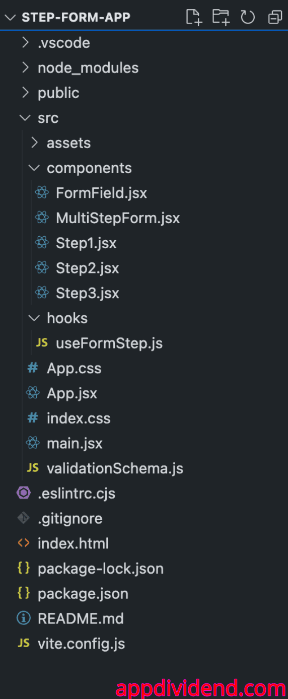
Here is a complete project structure:
Step 10: Run this project
Start the development server using this command:
npm run dev
Go to this URL: http://localhost:5173/ and our basic form’s first step looks like this:
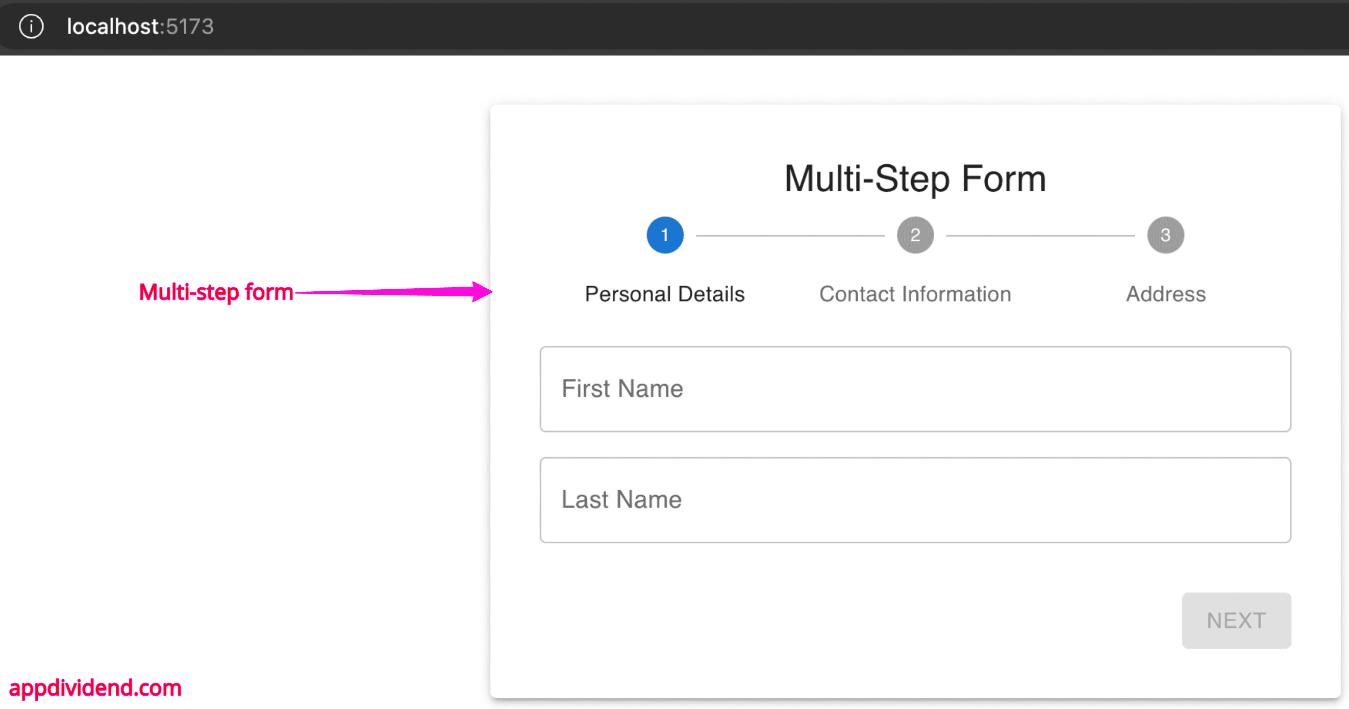
You can see that the “Next” button is disabled because we have yet to fill in any details!
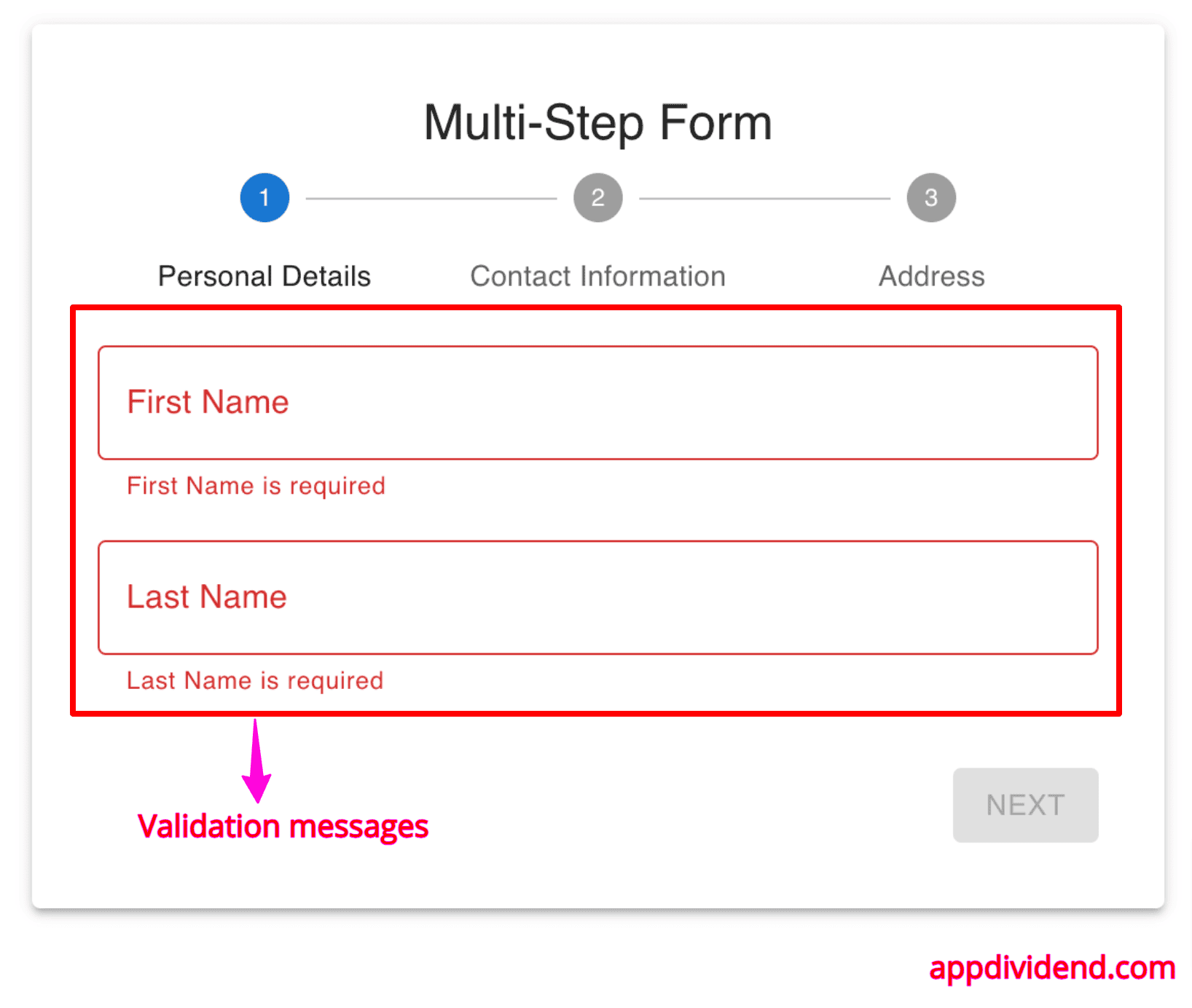
We also put the validation, and the validation message looks like this when it fails:
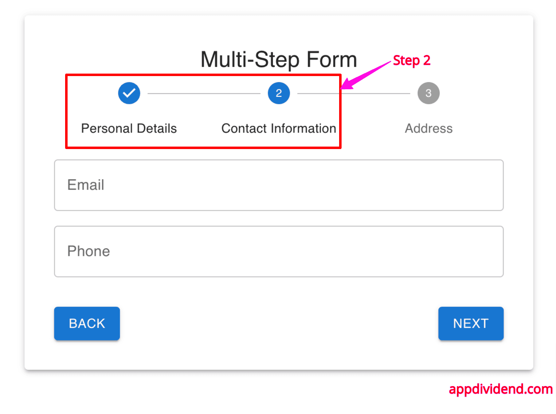
Let’s fill out the proper details and move to Step 2 of the form, which looks like this:
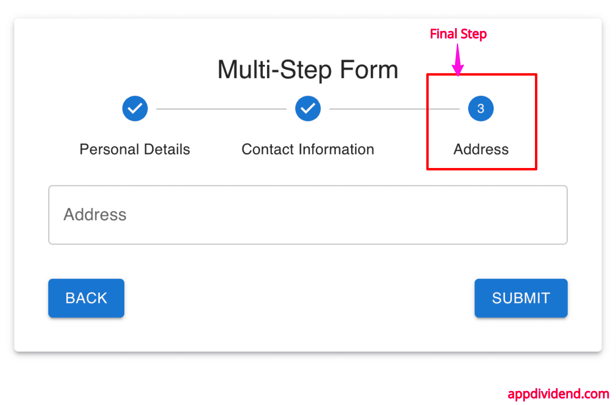
If you fill out the proper input, you will reach Step 3 of the form, which is the final step.
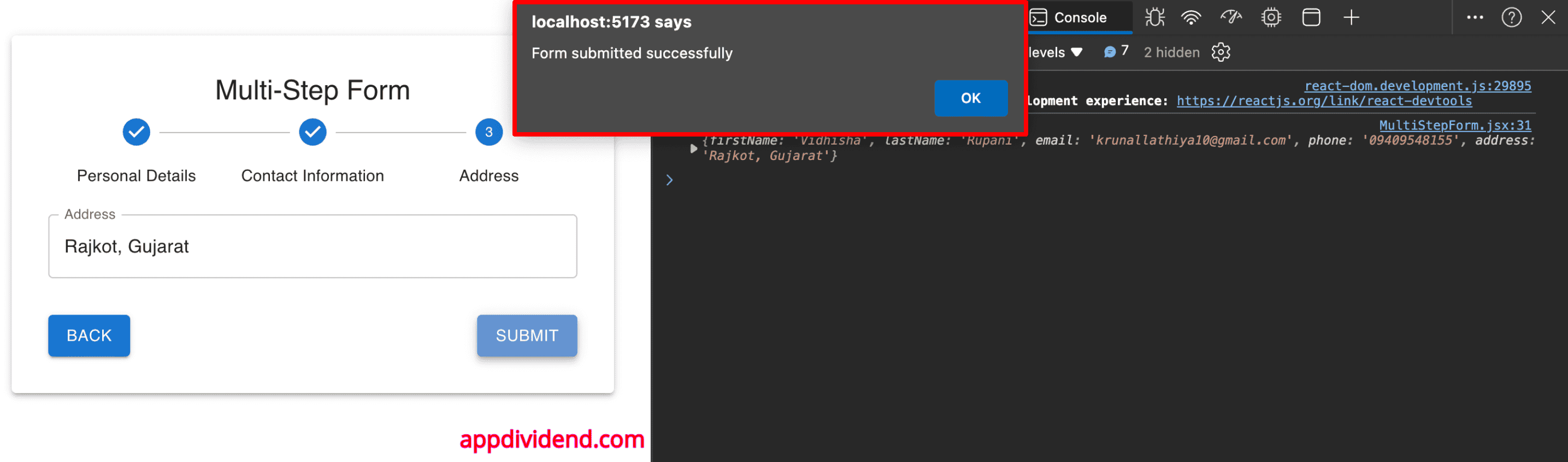
If you submit the data, it will alert you, “Form is submitted,” and log the form values in the console.
That’s all!
