
Datatables are integral to listing-type web applications, where you can search, sort, or paginate the data. Tables display information in a way that’s easy to scan so that users can get insights.
By the end of this tutorial, you will learn how to integrate Material UI in React and then use the DataGrid component to create a complete data table with pagination, sorting, searching, and filtering. You can customize the data table however you want.
When a user clicks the column header, each row in the data table will be selectable, and each column will be sortable. Here is the step-by-step guide:
Step 1: Setup React 18
We will use Vite to create a new project. Type the below command:
npm create vite@latest
It will prompt you to give a folder name, select React, select React + TypeScript or React + JavaScript, and create a boilerplate for you.
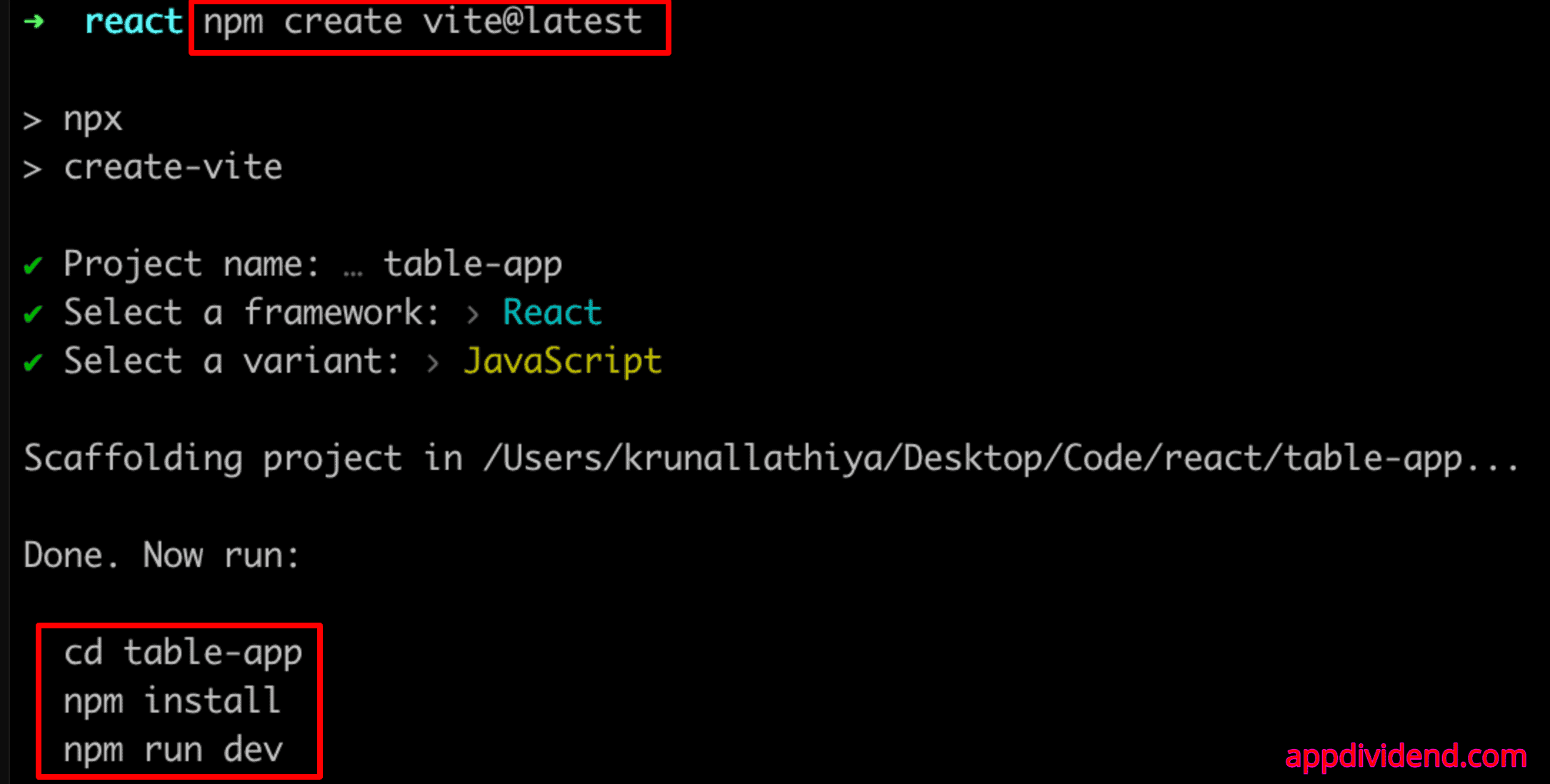
Go inside the “table-app” project folder and install the dependencies using this command:
cd table-app

npm install
Step 2: Removing the Default Code Set by React
Modify the src/main.jsx file and remove the index.css file from the code for this project. We don’t need that!
// main.jsx

import React from 'react'
import ReactDOM from 'react-dom/client'
import App from './App.jsx'

ReactDOM.createRoot(document.getElementById('root')).render(
  <React.StrictMode>
    <App />
  </React.StrictMode>,
)
Also, clear the code from src/App.jsx file, and after removing the code, it looks like this:
// src/App.jsx

function App() {
  return <></>;
}

export default App;
Step 3: Installing MUI, DataGrid and Axios
Type the following command to install MUI and DataGrid libraries:
npm install @mui/material @emotion/react @emotion/styled @mui/x-data-grid
For this example, we will fetch the data from an API: https://jsonplaceholder.typicode.com/todos
To send an HTTP GET request, we need to use axios or fetch library and display the retrieved data.
Let’s install the axios library and then use the axios.get() request to fetch the data.
npm install axios
Step 4: Create a DataTable Component
Inside the src folder, create a new file called DataTable.jsx and add the below code:
// DataTable.jsx

import { useState, useEffect } from "react";
import { DataGrid } from "@mui/x-data-grid";
import axios from "axios";

const columns = [
  { field: "userId", headerName: "User ID", width: 130 },
  { field: "id", headerName: "ID", width: 130 },
  { field: "title", headerName: "Title", width: 300 },
  { field: "completed", headerName: "Completed", width: 150, type: "boolean" },
];

const DataTable = () => {
  const [rows, setRows] = useState([]);

  useEffect(() => {
    axios
      .get("https://jsonplaceholder.typicode.com/todos")
      .then((response) => {
        setRows(response.data);
      })
      .catch((error) => {
        console.error("Error fetching data:", error);
      });
  }, []);

  return (
    <div style={{ height: 600, width: "100%" }}>
      <DataGrid
        rows={rows}
        columns={columns}
        pageSize={10}
        rowsPerPageOptions={[10, 20, 50]}
        checkboxSelection
      />
    </div>
  );
};

export default DataTable;
In this code, we used the useState hook to manage the functional component’s state and the useEffect hook to perform side effects, such as fetching data from an API.
We imported the DataGrid component from the @mui/x-data-grid package, also part of Material-UI. It displays the data in a tabular format. As we already discussed, the axios library is used to send network requests to the Server.
In the next step, we defined an array of columns filled with objects. Each object in the array represents the columns of the Datatable.
This object contains four properties:
- field: This column will display a key in the data.
- headerName: It displays the header for each column. In short, column names for the table.
- width: It sets the width of the column.
- type (optional): It specifies the data type in the column.
The DataTable is a functional component whose state is rows, and you can use the useState hook to modify the state.
In the next step, we used the axios.get() function to send a network request to API and fetch the data. If the request is successful (then), you can store the data as rows state using the setRows() function.
Step 5: Use the DataTable Component
You can use the DataTable component by importing it inside the src/App.jsx file like this:
// src/App.jsx

import DataTable from "./DataTable";

function App() {
  return (
    <>
      <DataTable />
    </>
  );
}

export default App;
Save the file and start the Vite development server using this command:
npm run dev
Go to this URL: http://localhost:5173/
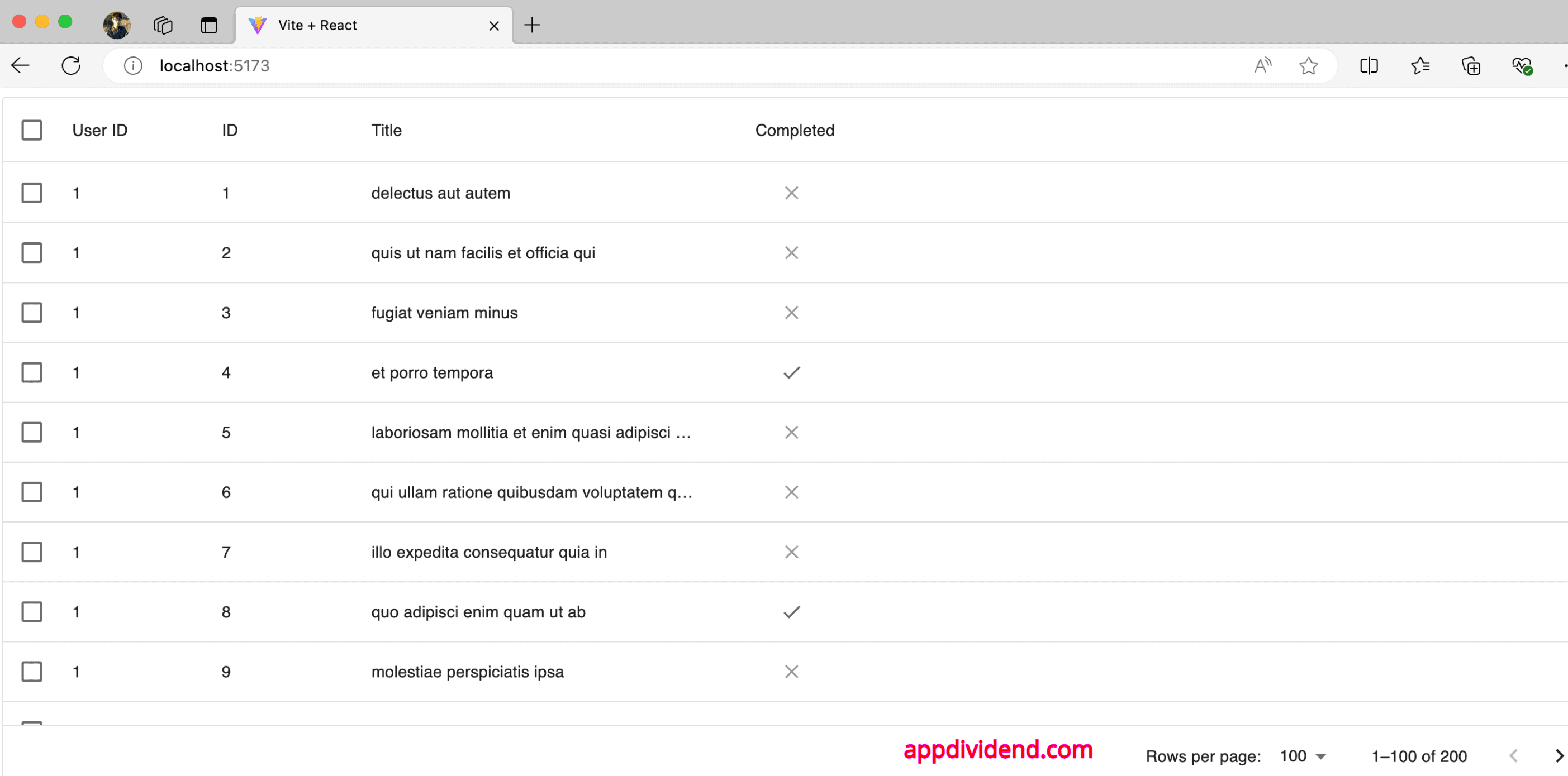
The output shows that you can sort the data by each column, select the rows, and use built-in pagination in the data table. We added a checkbox to select specific rows.
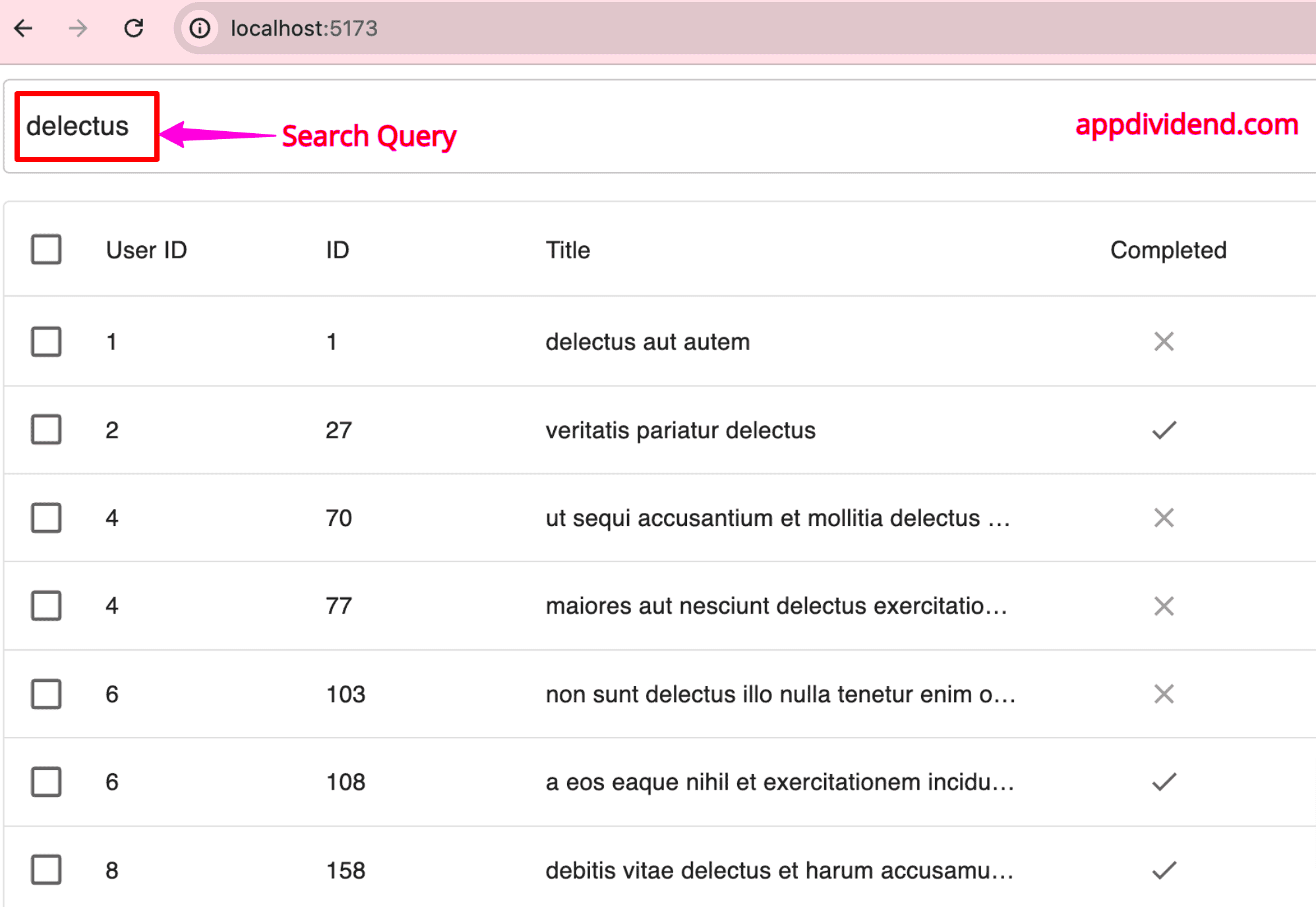
Step 6: Add Searching and Filtering
We can add a filter that displays rows based on the search query. To achieve that functionality, we need to add search bar where a user can type their query and then we will fetch the rows based on that query.
Modify the src/DataTable.jsx file and add the below in it:
// src/DataTable.jsx

import { useState, useEffect } from "react";
import { DataGrid } from "@mui/x-data-grid";
import { TextField, Box } from "@mui/material";
import axios from "axios";

const columns = [
  { field: "userId", headerName: "User ID", width: 130 },
  { field: "id", headerName: "ID", width: 130 },
  { field: "title", headerName: "Title", width: 300 },
  { field: "completed", headerName: "Completed", width: 150, type: "boolean" },
];

const DataTable = () => {
  const [rows, setRows] = useState([]);
  const [filteredRows, setFilteredRows] = useState([]);
  const [search, setSearch] = useState("");

  useEffect(() => {
    axios
      .get("https://jsonplaceholder.typicode.com/todos")
      .then((response) => {
        setRows(response.data);
        setFilteredRows(response.data);
      })
      .catch((error) => {
        console.error("Error fetching data:", error);
      });
  }, []);

  useEffect(() => {
    setFilteredRows(
      rows.filter((row) =>
        row.title.toLowerCase().includes(search.toLowerCase())
      )
    );
  }, [search, rows]);

  const handleSearchChange = (event) => {
    setSearch(event.target.value);
  };

  return (
    <div style={{ height: 700, width: "100%" }}>
      <Box sx={{ marginBottom: 2 }}>
        <TextField
          variant="outlined"
          placeholder="Search by Title"
          value={search}
          onChange={handleSearchChange}
          fullWidth
        />
      </Box>
      <DataGrid
        rows={filteredRows}
        columns={columns}
        rowsPerPageOptions={[5, 10, 20, 50]}
        pagination
        checkboxSelection
      />
    </div>
  );
};

export default DataTable;
We added two new states called “search” and “filteredRows”.
The second useEffect hook filters the rows based on the search query and updates filteredRows.
Save this file, go to the browser, and see the output.
Conclusion
If you use the DataGrid component with MUI Table in React, it will be very easy to create a Table with searching, sorting, filtering, and pagination functionality.
In this code example, we have seen how to create a new React project using Vite and then install MUI and x-data-grid library for the DataGrid component.
If you use the DataGrid component, you will have sorting and pagination functionality by default. The remaining thing is adding searching and filtering, which we did manually.
