

In real-life projects, web forms have one text input and multiple fields with different input types. React library does not provide any form-related modules, so we need to check out third-party libraries.
In the React community, Formik is currently a popular library for managing form states in web applications. It simplifies handling form values, validation, and submission.
We will use the Yup library to add validation. Thus, by combining Formik and Yup, we will create a complete web form with proper validation that includes text input, a radio button, and a checkbox.
Step 1: Setup React.js project
You can set up a new React project using the below command:
npm create vite@latest
Select “React” and “React + JavaScript”, and it will create a boilerplate.
Go inside the project folder and install the dependencies using this command:
npm install
Step 2: Setting Up Formik
First, install Formik and Yup (for validation):
npm install formik yup
Step 3: Install MUI
Install Material-UI and related libraries using the below command:
npm install @mui/material @emotion/react @emotion/styled
Step 4: Set Up the Form with MUI Components
We will create three components for text input, checkbox, and radio buttons and use MUI components for styling.
Inside the src folder, create a new folder called “FormComponents”, and inside that folder, create the following three files:
- TextInput.jsx
- RadioButtonGroup.jsx
- CheckboxInput.jsx
Add the below code inside the src/FormComponents/TextInput.jsx file:
import { TextField } from "@mui/material";
import { Field } from "formik";
import { styled } from "@mui/system";

const StyledTextField = styled(TextField)(({ theme }) => ({
  marginBottom: theme.spacing(3),
}));

// eslint-disable-next-line react/prop-types
const TextInput = ({ name, label, type }) => {
  return (
    <Field name={name}>
      {({ field, meta }) => (
        <StyledTextField
          {...field}
          label={label}
          type={type}
          variant="outlined"
          fullWidth
          error={meta.touched && !!meta.error}
          helperText={meta.touched && meta.error ? meta.error : ""}
        />
      )}
    </Field>
  );
};

export default TextInput;
In this component, we created text input fields using Material-UI’s TextField. Add the code below inside the src/FormComponents/RadioButton.jsx file:
import {
  FormControl,
  FormControlLabel,
  Radio,
  RadioGroup,
  FormHelperText,
} from "@mui/material";
import { Field } from "formik";
import { styled } from "@mui/system";

const StyledFormControl = styled(FormControl)(({ theme }) => ({
  marginBottom: theme.spacing(3),
}));

// eslint-disable-next-line react/prop-types
const RadioButtonGroup = ({ name, options }) => {
  return (
    <Field name={name}>
      {({ field, meta }) => (
        <StyledFormControl
          component="fieldset"
          error={meta.touched && !!meta.error}
        >
          <RadioGroup {...field}>
            {
              // eslint-disable-next-line react/prop-types
              options.map((option) => (
                <FormControlLabel
                  key={option.value}
                  value={option.value}
                  control={<Radio />}
                  label={option.label}
                />
              ))
            }
          </RadioGroup>
          {meta.touched && meta.error && (
            <FormHelperText>{meta.error}</FormHelperText>
          )}
        </StyledFormControl>
      )}
    </Field>
  );
};

export default RadioButtonGroup;
In this code, we created a component for radio buttons using Material-UI’s Radio, RadioGroup, and FormControl.
Add the code below inside the src/FormComponents/CheckboxInput.jsx file:
import { Checkbox, FormControlLabel, FormHelperText } from "@mui/material";
import { Field } from "formik";
import { styled } from "@mui/system";

const StyledFormControlLabel = styled(FormControlLabel)(({ theme }) => ({
  marginBottom: theme.spacing(3),
}));

// eslint-disable-next-line react/prop-types
const CheckboxInput = ({ name, label }) => {
  return (
    <Field name={name}>
      {({ field, meta }) => (
        <div>
          <StyledFormControlLabel
            control={<Checkbox {...field} checked={field.value} />}
            label={label}
          />
          {meta.touched && meta.error && (
            <FormHelperText error>{meta.error}</FormHelperText>
          )}
        </div>
      )}
    </Field>
  );
};

export default CheckboxInput;
In this component, we created a component for checkboxes using Material-UI’s Checkbox and FormControlLabel.
Step 5: Define a validation schema
Create a new file called “validationSchema.js” inside the “src” folder and add the below code:
// validationSchema.js

import * as Yup from 'yup';

const validationSchema = Yup.object({
    name: Yup.string().required('Name is required'),
    agreeToTerms: Yup.boolean().oneOf([true], 'You must accept the terms and conditions'),
    gender: Yup.string().required('Gender is required'),
});

export default validationSchema;
Step 6: Create a Main Form Component
We created three separate form field components and need to combine them to create a single form component.
Combine all the form components into the main form component and import the validation schema.
Inside the src folder, create a new file called “MainForm.jsx” and add the code below:
// MainForm.jsx

import { Formik, Form } from "formik";
import validationSchema from "./validationSchema";
import TextInput from "./FormComponents/TextInput";
import CheckboxInput from "./FormComponents/CheckboxInput";
import RadioButtonGroup from "./FormComponents/RadioButtonGroup";
import { Button, Paper, Typography } from "@mui/material";
import { styled } from "@mui/system";

const StyledPaper = styled(Paper)(({ theme }) => ({
  padding: theme.spacing(4),
  maxWidth: 600,
  margin: "auto",
}));

const MainForm = () => {
  return (
    <StyledPaper>
      <Typography variant="h4" gutterBottom>
        Registration Form
      </Typography>
      <Formik
        initialValues={{
          name: "",
          agreeToTerms: false,
          gender: "",
        }}
        validationSchema={validationSchema}
        onSubmit={(values) => {
          console.log("Form data", values);
        }}
      >
        {() => (
          <Form>
            <TextInput name="name" label="Name" type="text" />
            <CheckboxInput
              name="agreeToTerms"
              label="Agree to Terms and Conditions"
            />
            <RadioButtonGroup
              name="gender"
              options={[
                { value: "male", label: "Male" },
                { value: "female", label: "Female" },
              ]}
            />
            <Button type="submit" variant="contained" color="primary" fullWidth>
              Submit
            </Button>
          </Form>
        )}
      </Formik>
    </StyledPaper>
  );
};

export default MainForm;
We combined the individual components inside the MainForm component. We have used Formik to manage the form state and handle validation with Yup.
Step 7: Integrate everything in the App Component
The final step in our small project is to Import the MyForm component into your main application file. Modify the src/App.jsx file and add the code below:
// App.jsx

import { CssBaseline } from "@mui/material";
import MainForm from "./MainForm";

const App = () => {
  return (
    <>
      <CssBaseline />
      <div style={{ padding: "2em" }}>
        <MainForm />
      </div>
    </>
  );
};

export default App;
Our src/main.jsx file looks like this:
// main.jsx

import React from "react";
import ReactDOM from "react-dom/client";
import App from "./App.jsx";

ReactDOM.createRoot(document.getElementById("root")).render(
  <React.StrictMode>
    <App />
  </React.StrictMode>
);
Save this file and start the development server:
npm run dev
Go to this URL: http://localhost:5173/
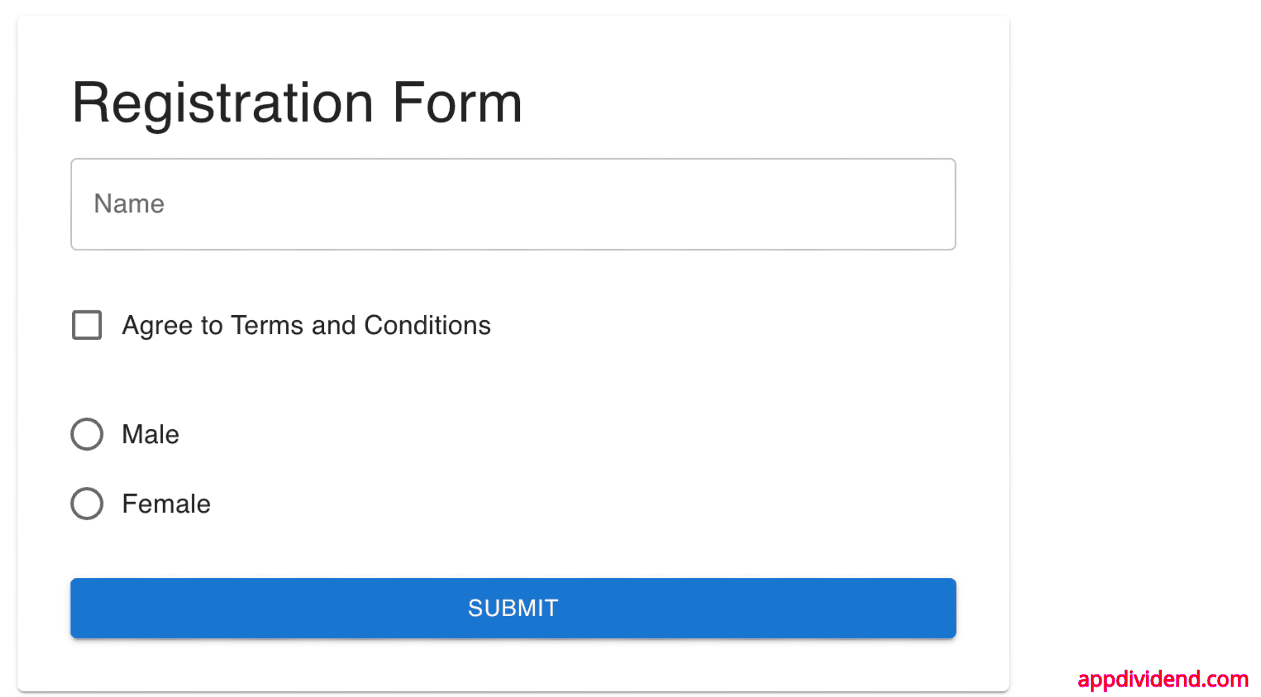
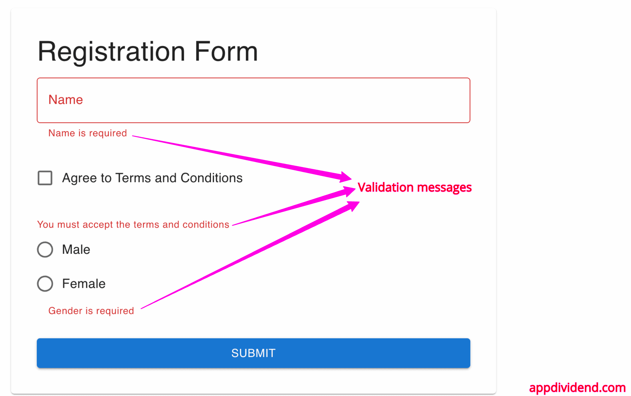
Let’s check the validation of each field:
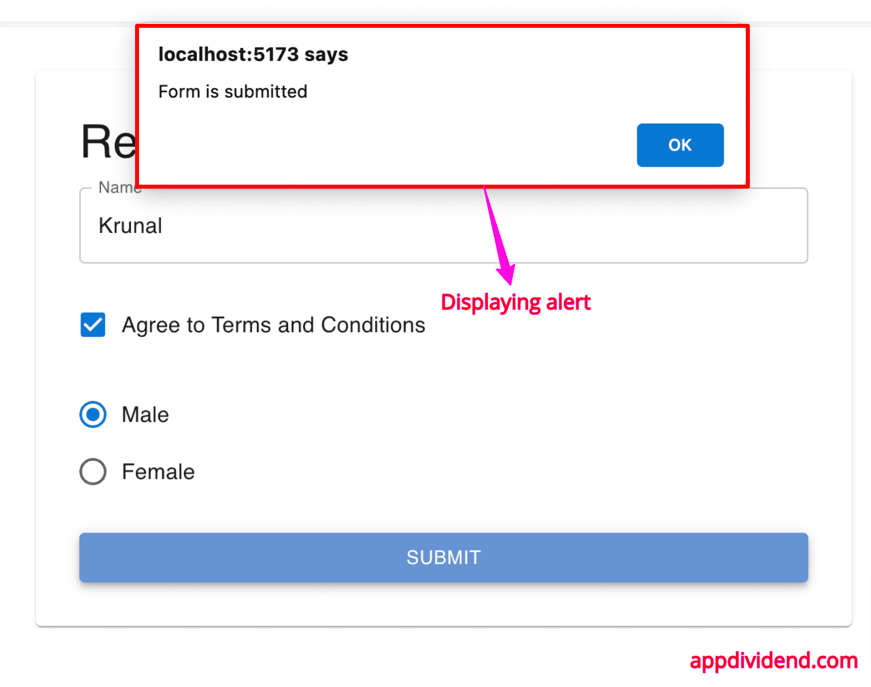
If you submit the form, you will see an alert saying, “Form is submitted“.
Conclusion
In this project, we created a clean, modular, and well-styled form using Formik, Yup, and MUI. These form components (TextInput, RadioButton, and Checkbox) are reusable and easy to understand and maintain, and the validation logic is separated to organize our code better.
