
Yesterday, I was working on a React project and encountered a scenario where I wanted to conditionally render the form fields, which meant I needed to show/hide them dynamically.
In this small project, we will create a form where we define a dropdown, and based on that dropdown value, we will show/hide the text input field.
The basic requirement for our project is that you have to install Node.js if you have not already installed it.
Here is the step-by-step guide:
Step 1: Create a new React Project
Type the following command to create a new Project using Vite bundler:
npm create vite@latest
It will ask you for some prompts, and you will select the React with JavaScript option. Then, it will create a project folder for you. Go inside the project directory and install the necessary packages:
npm install
Step 2: Install MUI, Formik, and Yup
Time to install Material-UI, Formik, and Yup libraries using the below command:
npm install formik yup @mui/material @emotion/react @emotion/styled @mui/icons-material
Step 3: Define a validation schema
Create a new file called validationSchema.js inside the src folder and add the code below:
// validationSchema.js

import * as Yup from 'yup';

const validationSchema = Yup.object({
    name: Yup.string().required('Name is required'),
    email: Yup.string().email('Invalid email address').required('Email is required'),
    option: Yup.string().required('Option is required'),
    additionalField: Yup.string().when('option', {
        is: 'show',
        then: Yup.string().required('Additional Field is required'),
    }),
});

export default validationSchema;
In this file, we added the Yup validation schema, including conditional validation for the additionalField.
Step 4: Create the Formik form with conditional rendering
Inside the src folder, create a new file called DynamicForm.jsx and add the code below:
// DynamicForm.jsx

import { useState } from "react";
import { Formik, Form, Field } from "formik";
import {
  TextField,
  Button,
  MenuItem,
  FormControl,
  InputLabel,
  Select,
  Typography,
} from "@mui/material";
import { styled } from "@mui/system";
import validationSchema from "./validationSchema";

const StyledForm = styled(Form)`
  display: flex;
  flex-direction: column;
  gap: 20px;
  width: 300px;
  margin: auto;
`;

const StyledField = styled(Field)`
  width: 100%;
`;

const DynamicForm = () => {
  const [showAdditionalFields, setShowAdditionalFields] = useState(false);

  return (
    <Formik
      initialValues={{ name: "", email: "", option: "", additionalField: "" }}
      validationSchema={validationSchema}
      onSubmit={(values) => {
        console.log(values);
      }}
    >
      {({ errors, touched }) => (
        <StyledForm>
          <Typography variant="h5" component="h1">
            Dynamic Form
          </Typography>
          <StyledField
            as={TextField}
            name="name"
            label="Name"
            error={touched.name && !!errors.name}
            helperText={touched.name && errors.name}
          />
          <StyledField
            as={TextField}
            name="email"
            label="Email"
            error={touched.email && !!errors.email}
            helperText={touched.email && errors.email}
          />
          <FormControl>
            <InputLabel id="option-label">Option</InputLabel>
            <StyledField
              as={Select}
              name="option"
              labelId="option-label"
              label="Option"
              onChange={(e) => {
                setShowAdditionalFields(e.target.value === "show");
              }}
            >
              <MenuItem value="hide">Hide</MenuItem>
              <MenuItem value="show">Show</MenuItem>
            </StyledField>
          </FormControl>
          {showAdditionalFields && (
            <StyledField
              as={TextField}
              name="additionalField"
              label="Additional Field"
              error={touched.additionalField && !!errors.additionalField}
              helperText={touched.additionalField && errors.additionalField}
            />
          )}
          <Button type="submit" variant="contained" color="primary">
            Submit
          </Button>
        </StyledForm>
      )}
    </Formik>
  );
};

export default DynamicForm;
In this code, we used Formik to manage form state and Yup for validation. It conditionally renders the additionalField based on the value of the option field.
Step 5: Adding styling and render the form
Edit the src/App.jsx file to include the DynamicForm.jsx component:
// App.jsx

import { Container, CssBaseline } from "@mui/material";
import DynamicForm from "./DynamicForm";

const App = () => {
  return (
    <Container component="main" maxWidth="xs">
      <CssBaseline />
      <DynamicForm />
    </Container>
  );
};

export default App;
Step 6: Run the project
You can run the project using the below command:
npm run dev
Go to this URL: http://localhost:5173/
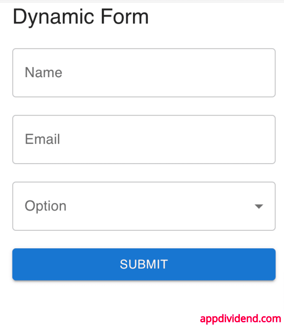
In this form, you can see that there are three fields:
- Name
- Option
The option field is a dropdown, and it has two values:
- Hide
- Show
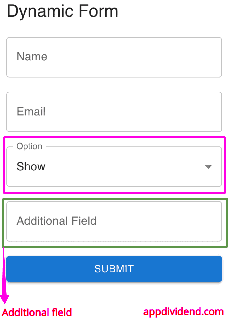
If you select the “Show” value, it will display the fourth field like this:
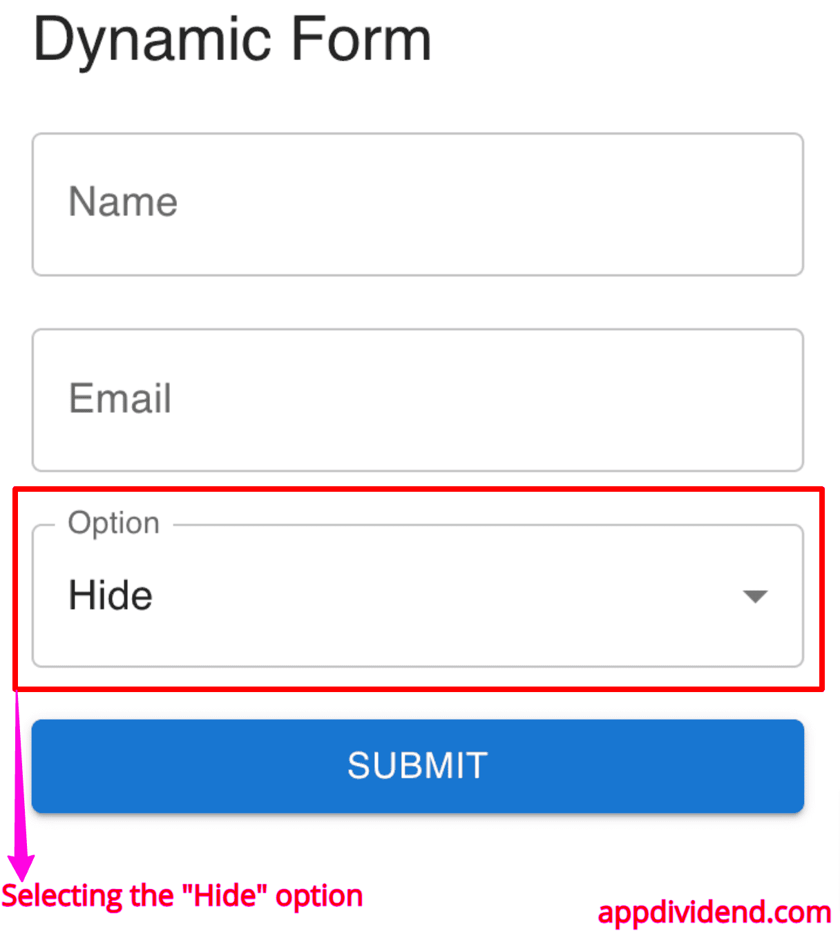
If you select the “Hide” value from the dropdown, the Additional Field will be hidden like this:
That’s all!
