

You can create a reusable form elements using Formik with custom input components in React.js by encapsulating input logic and styling, making your forms more reusable and maintainable.
Here is the step-by-step guide:
Step 1: Setup a new React project
We will create a new React project using Vite frontend builder because it is blazing fast. Type the command below:
npm create vite@latest
It will ask you to define a project name, then select React and JavaScript, and create a new project folder.
Go inside the project folder and install the necessary dependencies:
npm install
Step 2: Install MUI, Formik, and Yup
We are using MUI for styling and Formik to manage the form state. We will use Yup libraries for validation.
Type the command below to install all libraries:
npm install formik yup @mui/material @emotion/react @emotion/styled
Step 3: Define a validation schema
Let’s create a separate validation schema file for validation using Yup. Inside the src folder, create a new file called “validationSchema.js” and add the code below:
// validationSchema.js

import * as Yup from 'yup';

export const validationSchema = Yup.object().shape({
    username: Yup.string().required('Username is required'),
    email: Yup.string().email('Invalid email format').required('Email is required'),
    password: Yup.string().min(6, 'Password must be at least 6 characters').required('Password is required'),
});
Step 4: Create Custom Input Component
Create a new file called CustomInput.jsx inside the src directory.
// CustomInput.jsx

import { useField } from "formik";
import TextField from "@mui/material/TextField";

// eslint-disable-next-line react/prop-types
const CustomInput = ({ label, ...props }) => {
  const [field, meta] = useField(props);

  return (
    <div>
      <TextField
        {...field}
        {...props}
        label={label}
        error={meta.touched && Boolean(meta.error)}
        helperText={meta.touched && meta.error ? meta.error : ""}
        fullWidth
        margin="normal"
      />
    </div>
  );
};

export default CustomInput;
This CustomInput.jsx component will act as a skeleton for any type of text input. For example, you can pass input type = “text”, input type = “email”, or “password”.
Step 6: Create the Form Component
We created a custom input component. Now, we need to create a wrapper component which is a main Form component. You can call this component a parent component, and CustomInput.jsx will become a child component.
Create a new file called MainForm.jsx and add the code below:
// MainForm.jsx

import { Formik, Form } from "formik";
import CustomInput from "./CustomInput";
import { validationSchema } from "./validationSchema";
import Button from "@mui/material/Button";
import Box from "@mui/material/Box";

const MainForm = () => {
  return (
    <Formik
      initialValues={{
        username: "",
        email: "",
        password: "",
      }}
      validationSchema={validationSchema}
      onSubmit={(values) => {
        console.log("Form values", values);
      }}
    >
      {({ isSubmitting }) => (
        <Form>
          <Box sx={{ maxWidth: 400, margin: "auto" }}>
            <CustomInput label="Username" name="username" type="text" />
            <CustomInput label="Email" name="email" type="email" />
            <CustomInput label="Password" name="password" type="password" />
            <Button
              type="submit"
              variant="contained"
              color="primary"
              disabled={isSubmitting}
              fullWidth
              sx={{ mt: 2 }}
            >
              Submit
            </Button>
          </Box>
        </Form>
      )}
    </Formik>
  );
};

export default MainForm;
In this code, we used a Formik wrapper that accepts three properties:
- initialValues: It defines the initial state of input fields.
- validationSchema: It provides validation schema to validate the form fields.
- onSubmit: This function is called when the form is submitted. You can then send an HTTP POST request to the server. When the user submits the form, it logs the form values to the console.
We also used the “Form” component from Formik to act as a wrapper for form elements.
We used the MUI components for basic UI and styling.
You can see that we used the CustomInput component to create input fields for username, email, and password. Each CustomInput component is connected to Formik’s form state via the name prop, which matches the field names in initialValues.
The isSubmitting is a Formik state that suggests if the form is currently being submitted.
Step 7: Integrate and Style our Application
Ensure that you integrate MUI’s CssBaseline to normalize styles.
Modify the src/App.jsx code and add the code below:
// App.jsx

import MainForm from "./MainForm";
import CssBaseline from "@mui/material/CssBaseline";
import Container from "@mui/material/Container";
import Typography from "@mui/material/Typography";

const App = () => (
  <div>
    <CssBaseline />
    <Container maxWidth="sm">
      <Typography variant="h4" component="h1" gutterBottom>
        Sign Up
      </Typography>
      <MainForm />
    </Container>
  </div>
);

export default App;
And our src/main.jsx file looks like this:
// main.jsx

import React from "react";
import ReactDOM from "react-dom/client";
import App from "./App.jsx";

ReactDOM.createRoot(document.getElementById("root")).render(
  <React.StrictMode>
    <App />
  </React.StrictMode>
);
Step 8: Run the application
Start the development server using the command below:
npm run dev
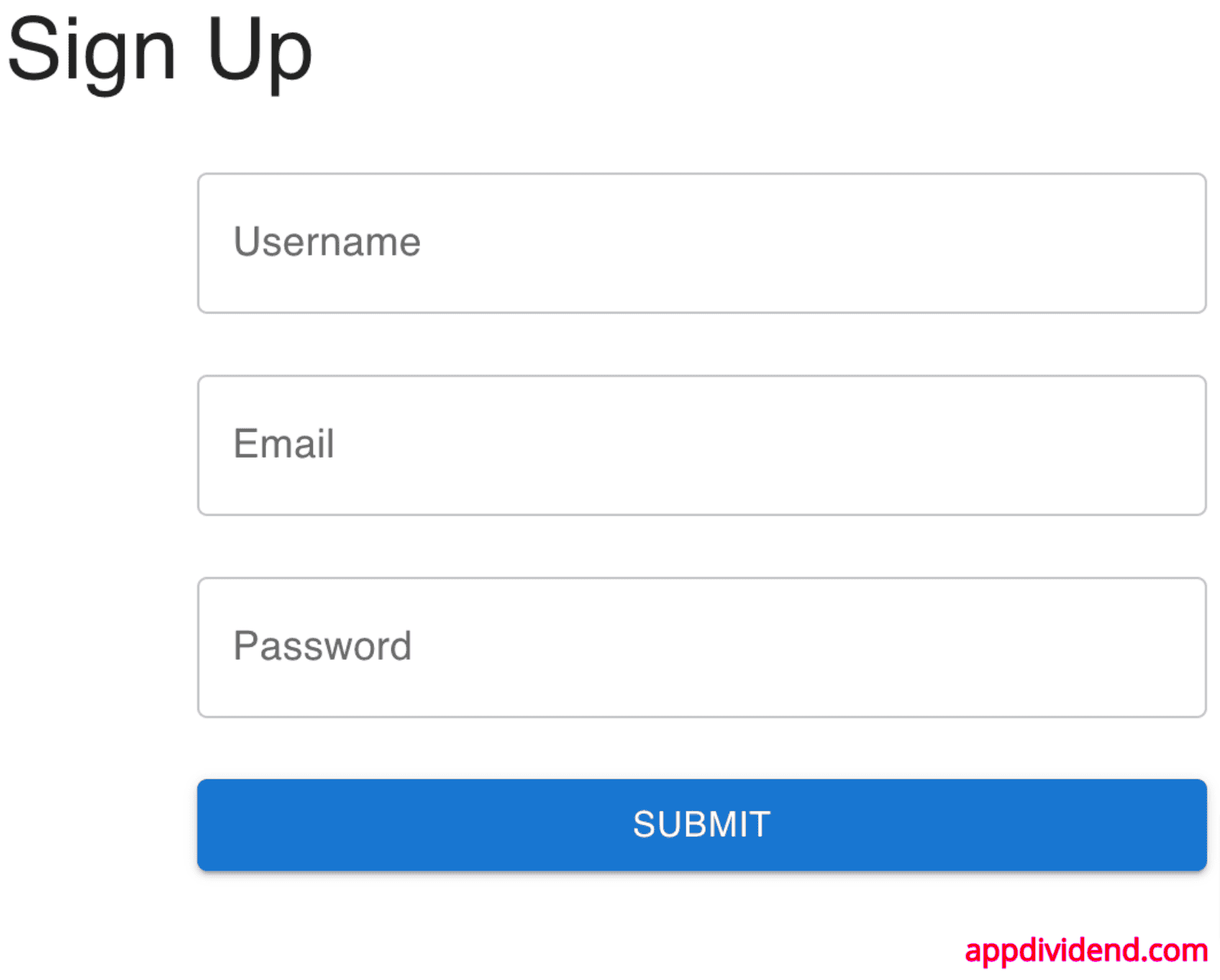
And you will see this basic form like this:
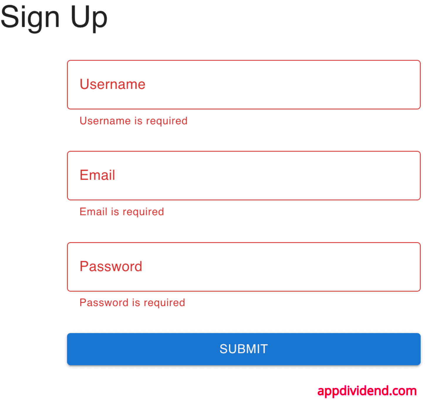
If you submit the form without filling in any input values, you will see a validation message like this:
If you fill in all the values correctly, you will see the logged value in the console.
Conclusion
In this code, we created a reusable custom input component that integrates with Formik for form handling and Material-UI for styling. This approach improves the maintainability and reusability of your forms.
