

Creating dynamic form fields means you can populate the input fields based on your requirements. For example, when uploading property photos, you might have two, four, or even ten photos. So, in each case, you need two upload fields, four upload fields, or ten.
This type of form field is needed when the user controls the number of fields a form should have.
In this post, we will create two input text fields and provide two buttons: Add and Delete. Users can populate the input text fields by clicking the Add button and remove the form fields if they want to. This makes our form dynamic, and each field has its validation.
We will use the Formik library for the FieldArray component and the Yup library for form field validation.
For styling our component, we will use the MUI library.
Here is the step-by-step guide:
Step 1: Setup React project
You can create a new React.js project using the below command:
npm create vite@latest
You need to assign a project name and then select a Framework, which is “React”, and then select a variant, which is “JavaScript”, in our case, but you can choose TypeScript as well. And it will create a project directory like this:
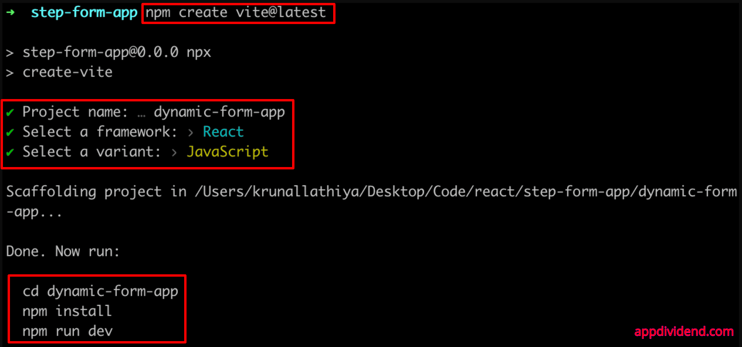
Go inside the project and install the necessary dependencies using this command:
npm install
Step 2: Install MUI
We will use Material-UI to create UI for our application. To use it, we need to install it first using the below command:
npm install @mui/material @emotion/react @emotion/styled @mui/icons-material
We also installed the Material Icons module.
Step 3: Install Formik and Yup
To manage the form state and validation, we will use the Formik and Yup libraries. Install it using the below command:
npm install formik yup
Step 4: Create a FieldArrayComponent
We will create a FieldArrayComponent.jsx file responsible for using Formik to manage a dynamic array of form fields. Yup handles validation, and Material-UI (MUI) and styled components handle styling.
The Formik library provides FieldArray, Field, and ErrorMessage components. To give style to components, we will use the “styled-components.”
Create a file called FieldArrayComponent.jsx inside the src folder and add the code below:
// FieldArrayComponent.jsx

import { FieldArray, Field, ErrorMessage } from "formik";
import TextField from "@mui/material/TextField";
import IconButton from "@mui/material/IconButton";
import DeleteIcon from "@mui/icons-material/Delete";
import AddIcon from "@mui/icons-material/Add";
import { styled } from "@mui/system";
import Typography from "@mui/material/Typography";

const Container = styled("div")({
  display: "flex",
  flexDirection: "column",
  gap: "16px",
});

const FieldContainer = styled("div")({
  display: "flex",
  flexDirection: "column",
  gap: "8px",
  marginBottom: "16px",
});

const InputContainer = styled("div")({
  display: "flex",
  gap: "16px",
  alignItems: "center",
  flexWrap: "wrap",
});

const ErrorText = styled(Typography)({
  color: "red",
  fontSize: "0.875rem",
  marginTop: "4px",
});

const ButtonContainer = styled("div")({
  display: "flex",
  alignItems: "center",
  gap: "8px",
});

// eslint-disable-next-line react/prop-types
const FieldArrayComponent = ({ name, values }) => {
  return (
    <FieldArray name={name}>
      {({ push, remove }) => (
        <Container>
          {
            // eslint-disable-next-line react/prop-types
            values.map((_, index) => (
              <FieldContainer key={index}>
                <InputContainer>
                  <div style={{ flex: 1 }}>
                    <Field
                      name={`${name}[${index}].name`}
                      as={TextField}
                      variant="outlined"
                      label="Name"
                      fullWidth
                      error={
                        // eslint-disable-next-line react/prop-types
                        !!(values[index].name && !values[index].name.trim())
                      }
                    />
                    <ErrorMessage
                      name={`${name}[${index}].name`}
                      component={ErrorText}
                    />
                  </div>
                  <div style={{ flex: 1 }}>
                    <Field
                      name={`${name}[${index}].email`}
                      as={TextField}
                      variant="outlined"
                      label="Email"
                      fullWidth

                      error={
                        // eslint-disable-next-line react/prop-types
                        !!(values[index].email && !values[index].email.trim())
                      }
                    />
                    <ErrorMessage
                      name={`${name}[${index}].email`}
                      component={ErrorText}
                    />
                  </div>
                  <ButtonContainer>
                    <IconButton
                      color="secondary"
                      onClick={() => remove(index)}
                      disabled={
                        // eslint-disable-next-line react/prop-types
                        values.length === 1
                      }
                    >
                      <DeleteIcon />
                    </IconButton>
                    {
                      // eslint-disable-next-line react/prop-types
                      index === values.length - 1 && (
                        <IconButton
                          color="primary"
                          onClick={() => push({ name: "", email: "" })}
                        >
                          <AddIcon />
                        </IconButton>
                      )
                    }
                  </ButtonContainer>
                </InputContainer>
              </FieldContainer>
            ))
          }
        </Container>
      )}
    </FieldArray>
  );
};

export default FieldArrayComponent;
Basically, in this code, the FieldArrayComponent renders a dynamic form with two input fields: name and email. Each set of fields has a delete button that removes it from the form. However, only the last set of fields has an add button.
We also display error messages below their respective input fields if validation fails.
Step 5: Define a Validation Schema
We will create a separate file to define a validation schema markup.
Create a new file called validationSchema.js inside the src folder and add the code below:
// validationSchema.js

import * as Yup from 'yup';

const validationSchema = Yup.object().shape({
    users: Yup.array().of(
        Yup.object().shape({
            name: Yup.string().required('Name is required'),
            email: Yup.string().email('Invalid email').required('Email is required'),
        })
    ),
});

export default validationSchema;
Step 6: Create a dynamic form
Create a new file called DynamicForm.jsx and add the code below:
// DynamicForm.jsx

import { Formik, Form } from "formik";
import Button from "@mui/material/Button";
import { styled } from "@mui/system";
import FieldArrayComponent from "./FieldArrayComponent";
import validationSchema from "./validationSchema";

const StyledForm = styled(Form)({
  display: "flex",
  flexDirection: "column",
  gap: "16px",
});

const initialValues = {
  users: [
    {
      name: "",
      email: "",
    },
  ],
};

const DynamicForm = () => {
  const handleSubmit = (values) => {
    console.log(values);
  };

  return (
    <Formik
      initialValues={initialValues}
      validationSchema={validationSchema}
      onSubmit={handleSubmit}
    >
      {({ values }) => (
        <StyledForm>
          <FieldArrayComponent name="users" values={values.users} />
          <Button variant="contained" color="warning" type="submit">
            Submit
          </Button>
        </StyledForm>
      )}
    </Formik>
  );
};

export default DynamicForm;
The DynamicForm is a functional component that sets up a web form with dynamic fields using formik. The handleSubmit() function handles the submission of forms.
- The Formik Wraps the form, handling state, validation, and submission.
- The FieldArrayComponent renders dynamic form fields for users.
- When you click the submit button, it will submit the form and log the array of field values in the console.
Step 7: Integrate everything in the App Component
Import the DynamicForm component inside the src/App.jsx file and add some styling:
// App.jsx

import DynamicForm from "./DynamicForm";
import Container from "@mui/material/Container";
import Typography from "@mui/material/Typography";

function App() {
  return (
    <Container maxWidth="md">
      <Typography variant="h5" align="center" gutterBottom>
        Formik Field Arrays with MUI
      </Typography>
      <DynamicForm />
    </Container>
  );
}

export default App;
And here is the modified src/main.jsx file:
// main.jsx

import React from "react";
import ReactDOM from "react-dom/client";
import App from "./App.jsx";

ReactDOM.createRoot(document.getElementById("root")).render(
  <React.StrictMode>
    <App />
  </React.StrictMode>
);
Step 8: Run the application
You can run the React application using the command below:
npm run dev
Go to this URL: http://localhost:5173/
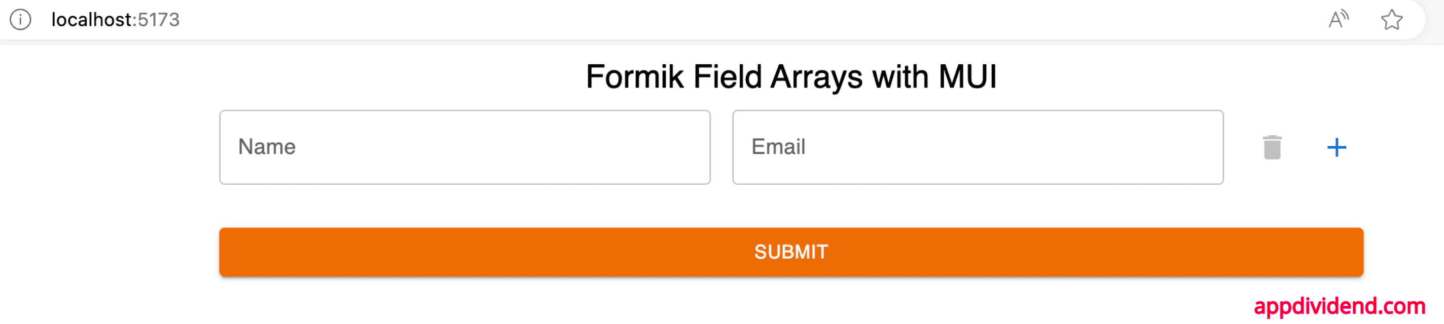
You can add dynamic input fields by clicking on the “+” button, and it will clone it like this:
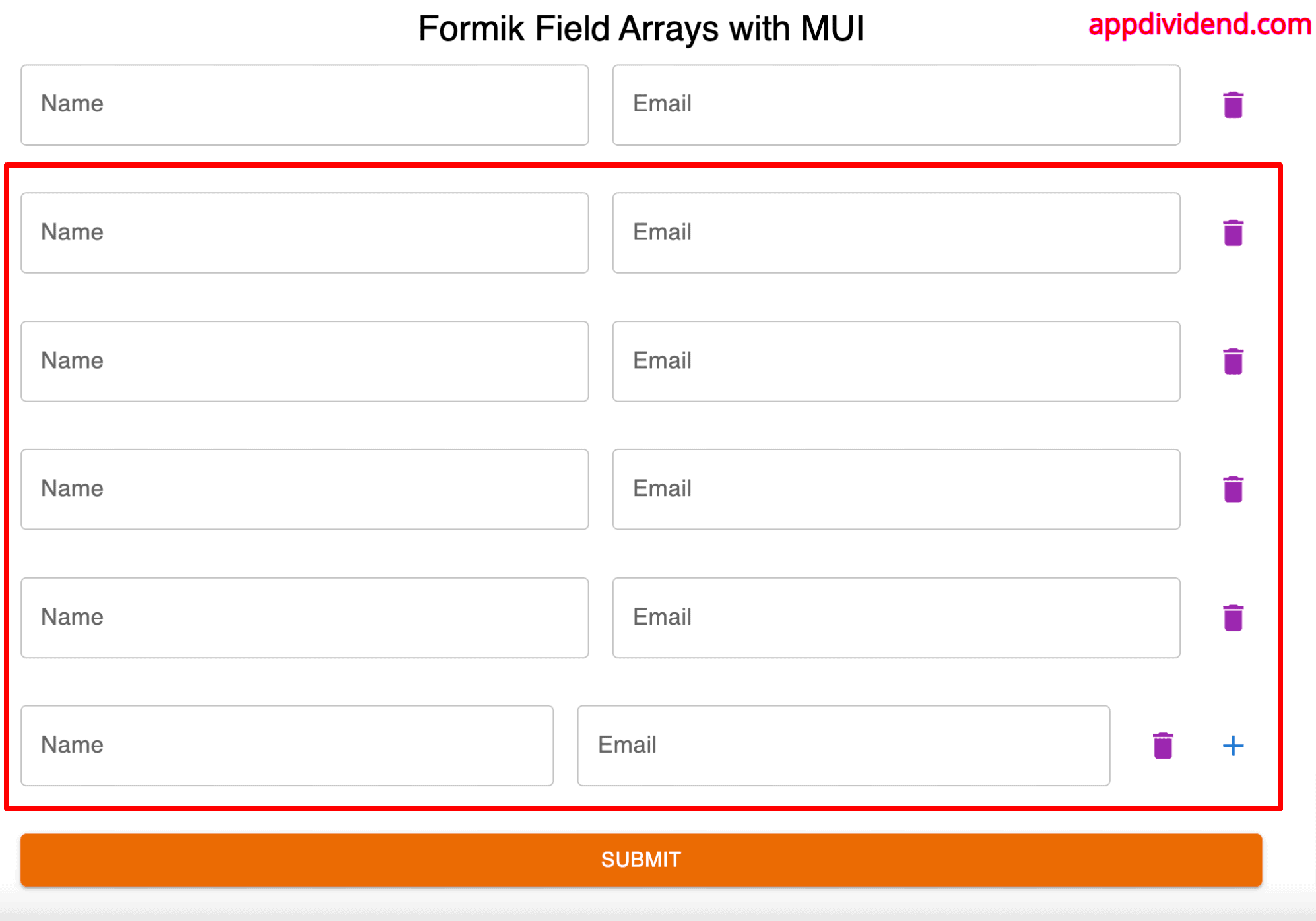
You can also delete the fields if you find them unnecessary, and it won’t delete the original set of fields because the button would be disabled in that case.
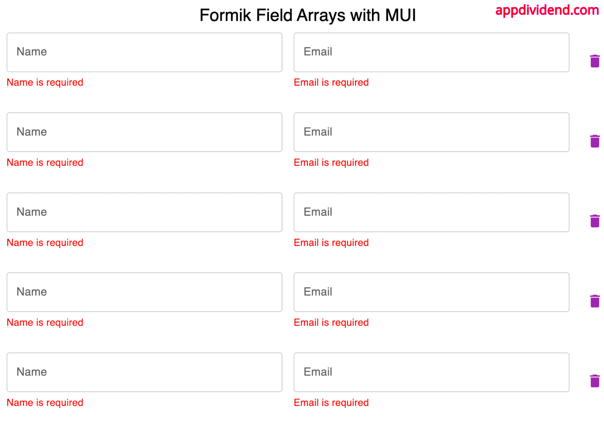
Let’s check the validation for each field:
If you fill in the details correctly, you can see the logged values in the console.
Conclusion
In this article, we have seen how to create a new React Project using Vite and installed the MUI, Formik, and Yup libraries. We created a dynamic form using Formik’s FieldArray component, populated a set of fields, and added a validation using the Yup library.
