

The checkbox is an HTML element that allows users to select single or multiple options.
For this tutorial, we will use the Angular Material library. We will learn how to install it in our project and efficiently use the checkbox component.
Angular Material library provides a component called <mat-checkbox> that allows users to select one or more options from a set.
The <mat-checkbox> component provides the same functionality as a native HTML <input type=”checkbox”>, but it is enhanced with Material Design styling and animations. As a UI/UX developer, I know that design and user experience are pivotal in web applications.
Here is the step-by-step guide:
Step 1: Setup new Angular Project
You must install the Angular CLI in your system to create a new Project. If you have not installed it, type the following command:
npm install -g @angular/cli
It will install Angular CLI 18 since it is the latest version.
Now, you can create a new Angular project using the below command:
ng new checkbox-app

cd checkbox-app
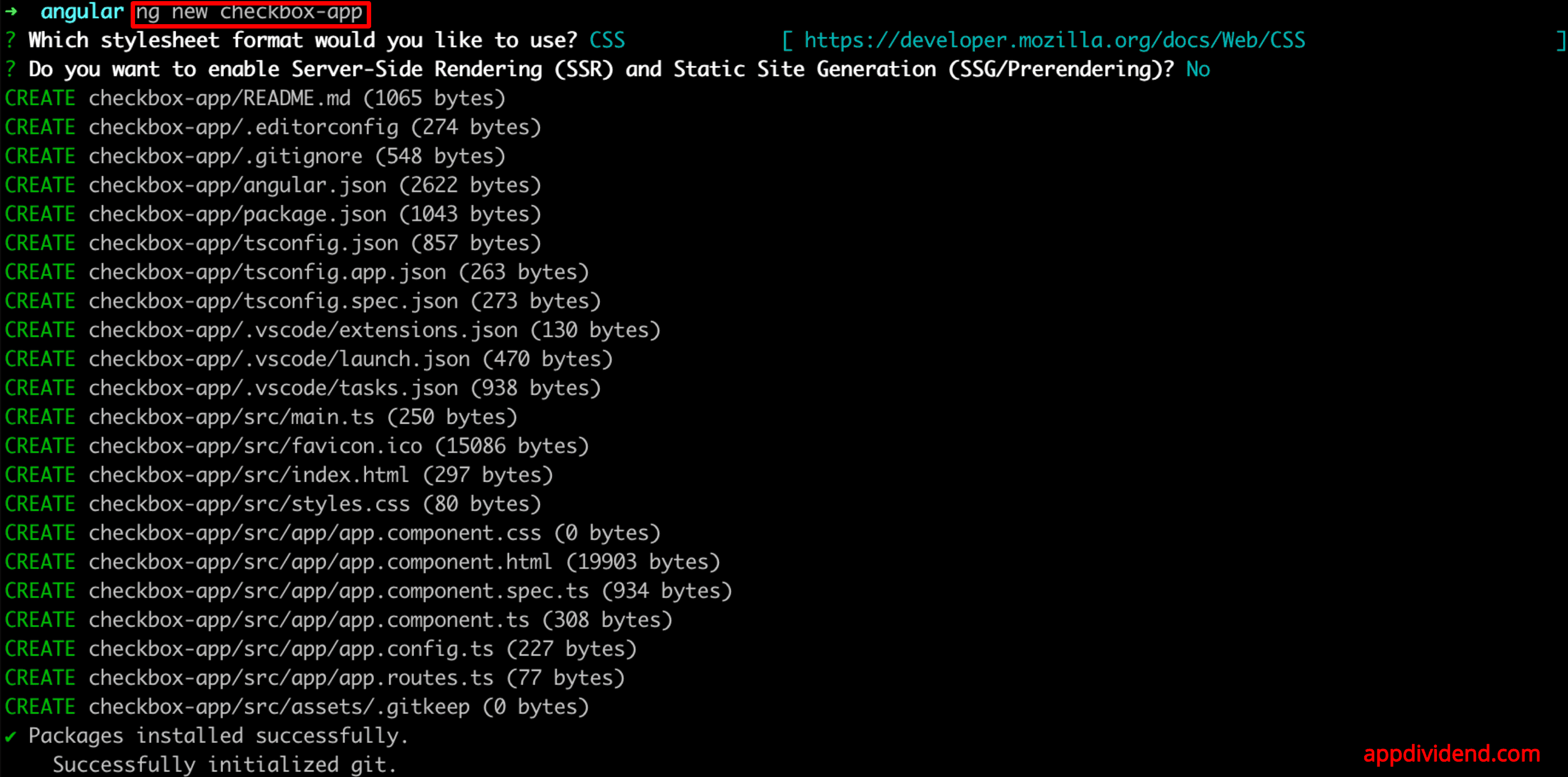
As you can see, we installed a new project.
Step 2: Install Angular Material
You can add Material Design to your project using the below command:
ng add @angular/material
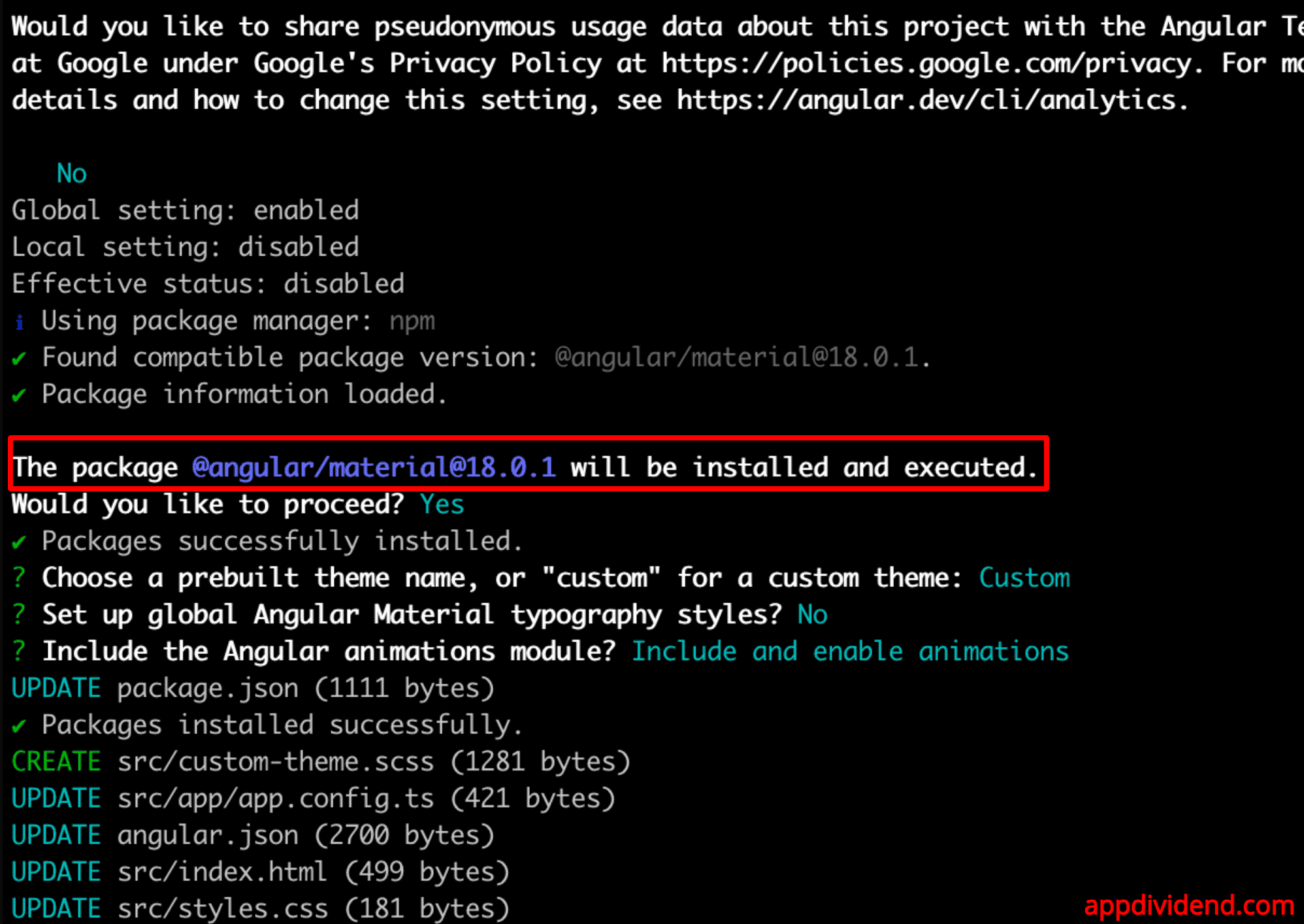
While installing a library, we were prompted to choose a prebuilt theme. Select one based on your preference (e.g., Indigo/Pink or custom, just like I did).
Since I chose a custom theme, it will create a new file, src/custom-theme.css, and the rest of the file will be updated automatically, as you can see from the above screenshot.
Step 3: Import Material Checkbox Module
Open the src/app/app.component.ts file and import the MatCheckboxModule like this:
import { Component } from '@angular/core';
import { RouterOutlet } from '@angular/router';
import { MatCheckboxModule } from '@angular/material/checkbox';
import { FormsModule } from '@angular/forms';
import { CommonModule } from '@angular/common';

@Component({
  selector: 'app-root',
  standalone: true,
  imports: [RouterOutlet, MatCheckboxModule, FormsModule, CommonModule],
  templateUrl: './app.component.html',
  styleUrl: './app.component.css',
})

export class AppComponent {
  isChecked = false;
}
We initialized the isChecked property to false. This property is bound to the checkbox, which determines its state.
Step 4: Add the Material Checkbox in your component template
Add the following code inside the src/app/app.component.html file:
<h1>Angular Material Checkbox Example</h1>

<mat-checkbox [(ngModel)]="isChecked">Check me!</mat-checkbox>

<p [ngClass]="isChecked ? 'checked-text' : 'unchecked-text'">
  Checkbox is: {{ isChecked ? "checked" : "unchecked" }}
</p>
The code [(ngModel)]=”isChecked” denotes a two-way data binding syntax, which binds the isChecked property in the component class to the checkbox.
When the checkbox is checked or unchecked, the isChecked property in the component class is updated automatically due to the two-way binding ([(ngModel)]).
The <mat-checkbox> element is compatible with @angular/forms and supports FormsModule and ReactiveFormsModule.
Also, import the FormsModule and CommonModule inside src/app/app.component.ts file:
import { Component } from '@angular/core';
import { RouterOutlet } from '@angular/router';
import { MatCheckboxModule } from '@angular/material/checkbox';
import { FormsModule } from '@angular/forms';
import { CommonModule } from '@angular/common';

@Component({
  selector: 'app-root',
  standalone: true,
  imports: [RouterOutlet, MatCheckboxModule, FormsModule, CommonModule],
  templateUrl: './app.component.html',
  styleUrl: './app.component.css',
})

export class AppComponent {
  isChecked = false;
}
Step 5: Add Styling
Let’s customize the appearance by adding some CSS code in the src/app/app.component.css file:
.checked-text {
  color: green;
}

.unchecked-text {
  color: red;
}
Step 6: Run the Application
Go to the terminal and start the Angular development server using this command:
ng serve --open
It will open the URL in the browser: http://localhost:4200/
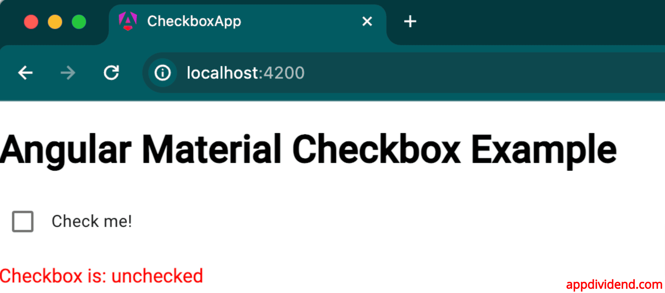
You can see that the checkbox is unchecked. That’s why we got the unchecked in the red font.
If you click the checkbox, the checkbox is checked.

Based on two-way data binding, we are changing the state of the isChecked property.
So, here is how you can handle the single checkbox value in Angular.

Amit Parmar
Thanks for explaining the things. There are many-things which clears my doubt .
David
Step 5: Implement a patch workaround for using form in edit mode! 🙂