
To create a select / multi-select dropdown in React.js, you can use the “react-dropdown-select” library.
Dropdown is a type of form control in which you can select a single or multiple items from predefined options.
These options can be static or dynamic. If dynamic, they might come from the database.
In the React developer community, the “react-dropdown-select” library is very famous and helpful for implementing a dropdown menu. It provides various customizable options suitable for our requirements.
Here is the step-by-step guide:
Step 1: Create a React.js project
To create a React.js 18 boilerplate, we will use the Vite bundler.
Vite is a build tool that aims to provide a faster and leaner development experience for modern web projects.
You can install vite using this command if you have not installed already:
npm i vite
After installing vite, you can type the following command to create a new React.js boilerplate project using this command:
npm create vite@latest dropdown-app -- --template react
In the above command you will see that we are creating a new application in React.js –template react means it will create a React application.
After creating a “dropdown-app”, go inside a folder:
cd dropdown-react
Install the project dependencies using this command:
npm install
Now start the vite development server using this command:
npm run dev
Go to this URL: http://localhost:5173/
Step 2: Install a react-dropdown-select library
You can install the react-dropdown-select library using this command:
npm install --save react-dropdown-select
Also, install the Bootstrap 5 CSS Framework using this command:
npm install bootstrap --save
Step 3: Implement dropdown functionality
Open the App.jsx file inside the “src” folder and replace the existing code with the below code:
import React, { useState } from 'react';
import Dropdown from 'react-dropdown-select';
import 'bootstrap/dist/css/bootstrap.min.css';

const techCompanies = [
  { label: "Apple", value: 1 },
  { label: "Facebook", value: 2 },
  { label: "Netflix", value: 3 },
  { label: "Tesla", value: 4 },
  { label: "Amazon", value: 5 },
  { label: "Alphabet", value: 6 },
];

const App = () => {
  const [selected, setSelected] = useState([]);

  const handleSelect = (values) => {
    setSelected(values);
  };

  return (
    <div className="container mt-4">
      <h2 className="mb-3">Pick a Tech Company:</h2>
      <Dropdown
        options={techCompanies}
        values={selected}
        onChange={handleSelect}
        style={{ width: '300px', marginBottom: '20px' }}
      />
      {selected.length > 0 && (
        <div className="alert alert-primary" role="alert">
          Selected Company: {selected[0].label}
        </div>
      )}
    </div>
  );
};

export default App;
First, we imported React and useState hook from the core React library.
Then, we imported the Dropdown module and bootstrap css file.
In the next step, we defined a static options array with labels and values.
Then, we defined a functional component App(), which we will export.
The “const [selected, setSelected] = useState([])” is a React hook that allows functional components to manage state and use other React features without needing to convert them into class components.
The “selected” is a current state value, and setSelected() is a function that updates it. When the setSelected() function is called, it sets selected to the new value provided.
Then, we defined a function that updates the selected state value.
Finally, we return to the JSX part responsible for displaying the dropdown component.
If you select any option value from the dropdown, it will display underneath like this:
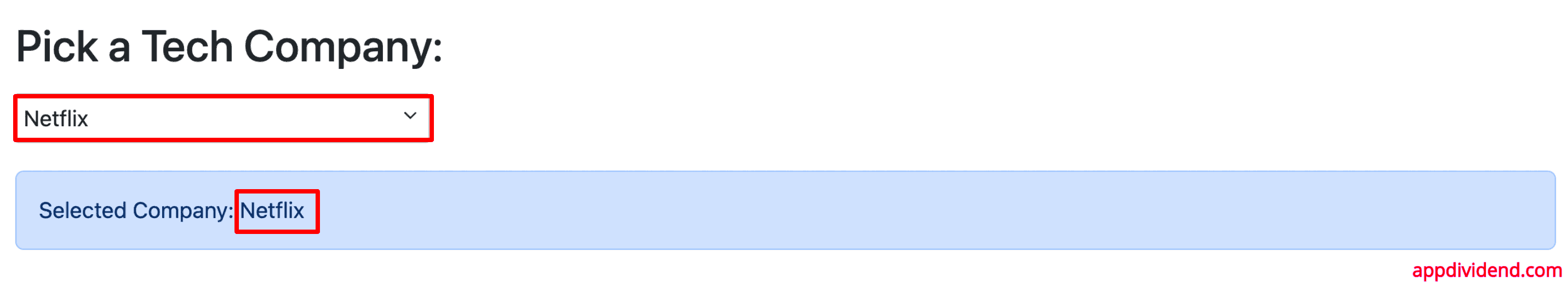
If you change the option, the Selected Company in the blue background will also be changed.
This is a functional dropdown where we display the selected value. You can now send this value to the server and save it to the database.
This is a simple implementation of dropdown select form control.
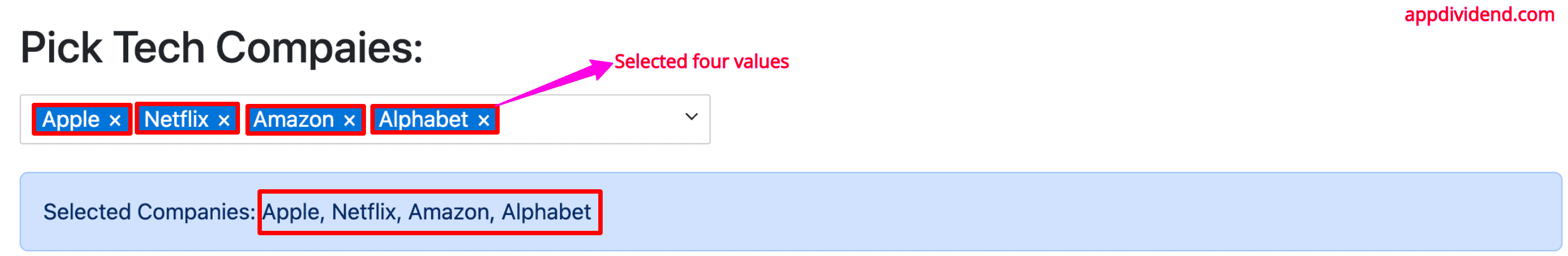
Multi-select dropdown
To create a multi-select dropdown, you need to pass the property multi={true} to the <Dropdown> component like this:
// App.jsx

<Dropdown
        options={techCompanies}
        values={selected}
        onChange={handleSelect}
        style={{ width: '300px', marginBottom: '20px' }}
        multi={true}
/>
The complete looks like this:
// App.jsx

import React, { useState } from 'react';
import Dropdown from 'react-dropdown-select';
import 'bootstrap/dist/css/bootstrap.min.css';

const techCompanies = [
  { label: "Apple", value: 1 },
  { label: "Facebook", value: 2 },
  { label: "Netflix", value: 3 },
  { label: "Tesla", value: 4 },
  { label: "Amazon", value: 5 },
  { label: "Alphabet", value: 6 },
];

const App = () => {
  const [selected, setSelected] = useState([]);

  const handleSelect = (values) => {
    setSelected(values);
  };

  return (
    <div className="container mt-4">
      <h2 className="mb-3">Pick Tech Companies:</h2>
      <Dropdown
        options={techCompanies}
        values={selected}
        onChange={handleSelect}
        style={{ width: '500px', marginBottom: '20px' }}
        multi={true}
      />
      {selected.length > 0 && (
        <div className="alert alert-primary" role="alert">
          Selected Companies: {selected.map(company => company.label).join(', ')}
        </div>
      )}
    </div>
  );
};

export default App;
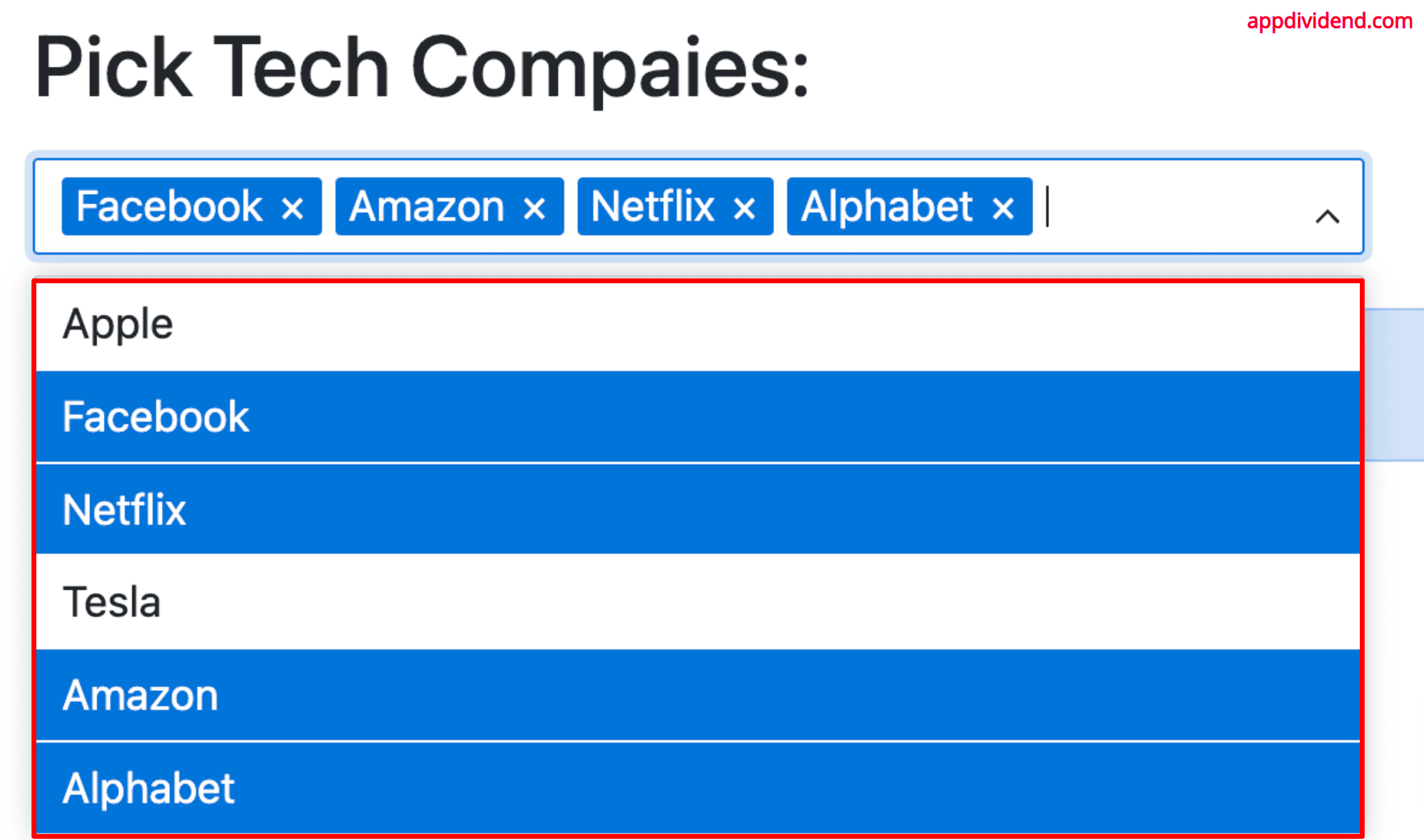
Output
Default selection value
You can specify the default selection value using the “values” property:
// App.jsx

<Dropdown
        options={techCompanies}
        values={[techCompanies[2]]}
        onChange={handleSelect}
        style={{ width: '500px', marginBottom: '20px' }}
        multi={true}
/>
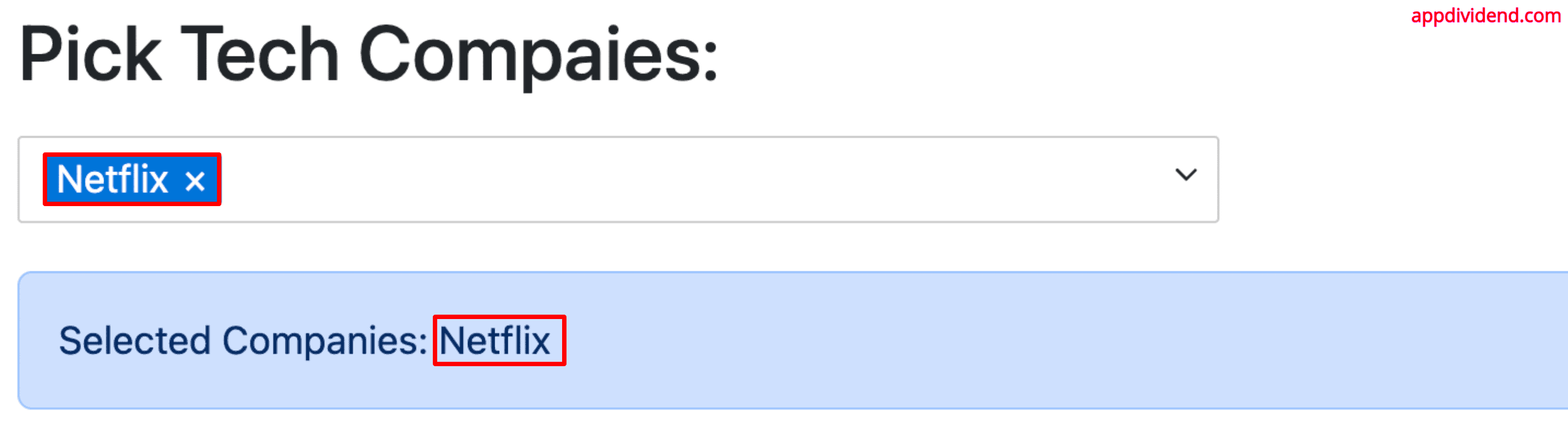
It will select Netflix by default when you refresh the page like this:
Keeping the dropdown menu open
You can keep the dropdown menu open while selecting the options by passing the keepOpen boolean value to true.
// App.jsx

<Dropdown
        options={techCompanies}
        values={selected}
        onChange={handleSelect}
        style={{ width: '500px', marginBottom: '20px' }}
        keepOpen={true}
        multi={true}
/>
Output
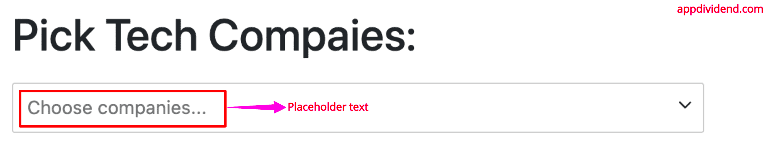
Placeholder string
You can set a custom placeholder text using the placeholder=“Choose a company…” property:
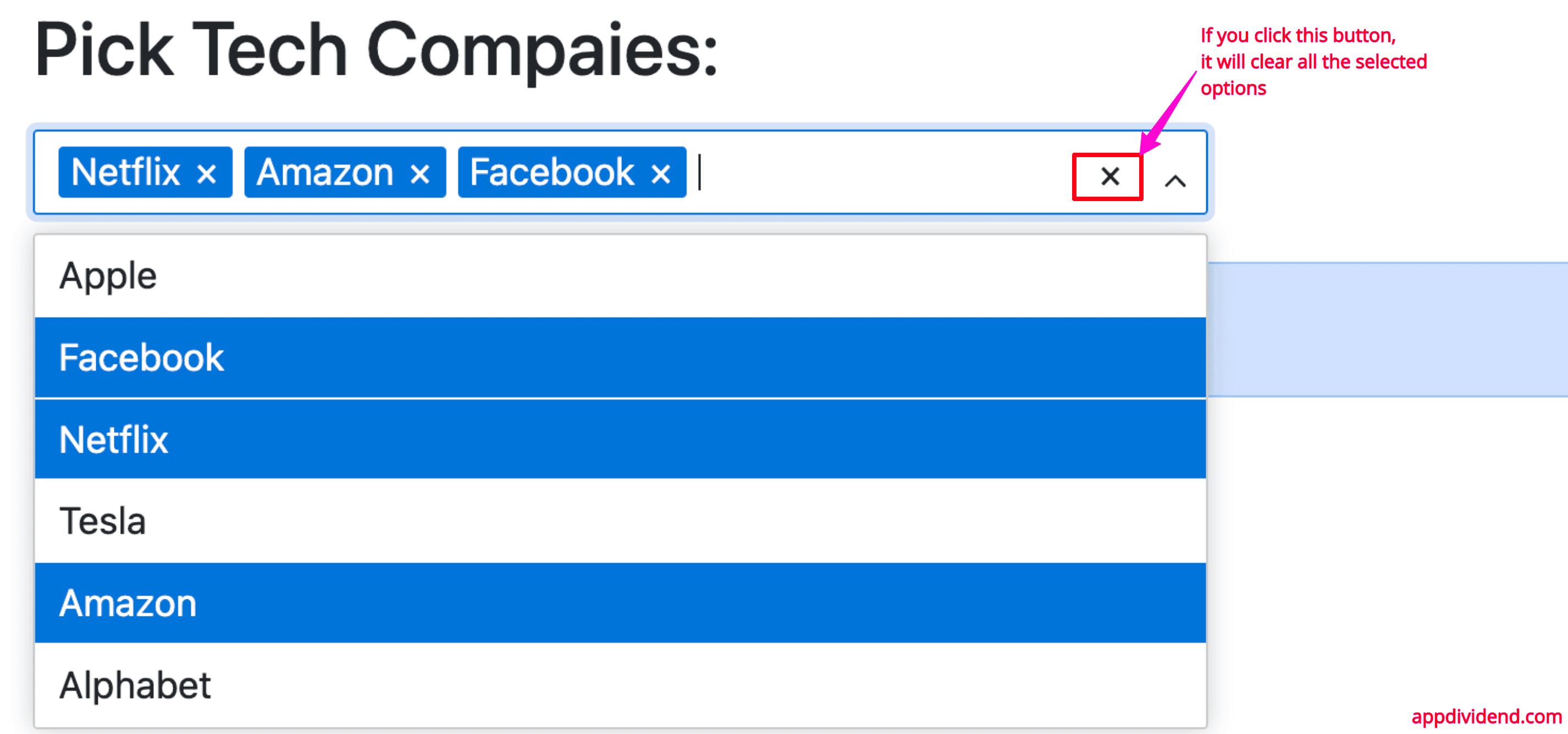
Clearing the selected options
You can add a button to clear all selected options by passing clearable = {true}:
// App.jsx

<Dropdown
        options={techCompanies}
        values={selected}
        onChange={handleSelect}
        style={{ width: '500px', marginBottom: '20px' }}
        clearable ={true}
        multi={true}
/>
Output
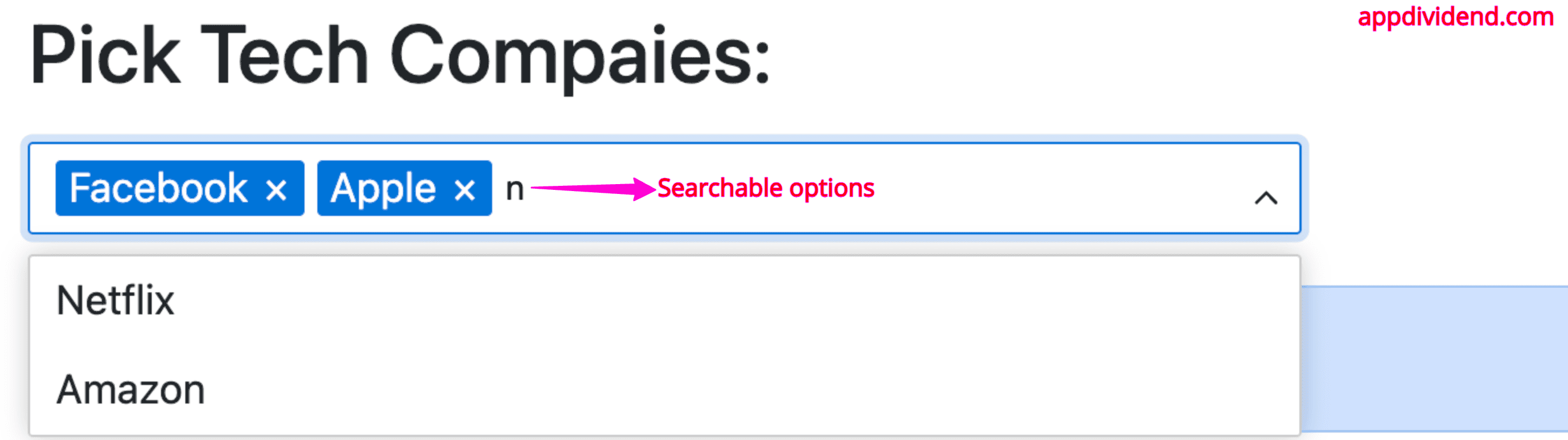
Searchable options
You can search the input options by passing the searchable={true} property:
// App.jsx

<Dropdown
        options={techCompanies}
        values={selected}
        onChange={handleSelect}
        style={{ width: '500px', marginBottom: '20px' }}
        searchable={true}
        multi={true}
/>
Output
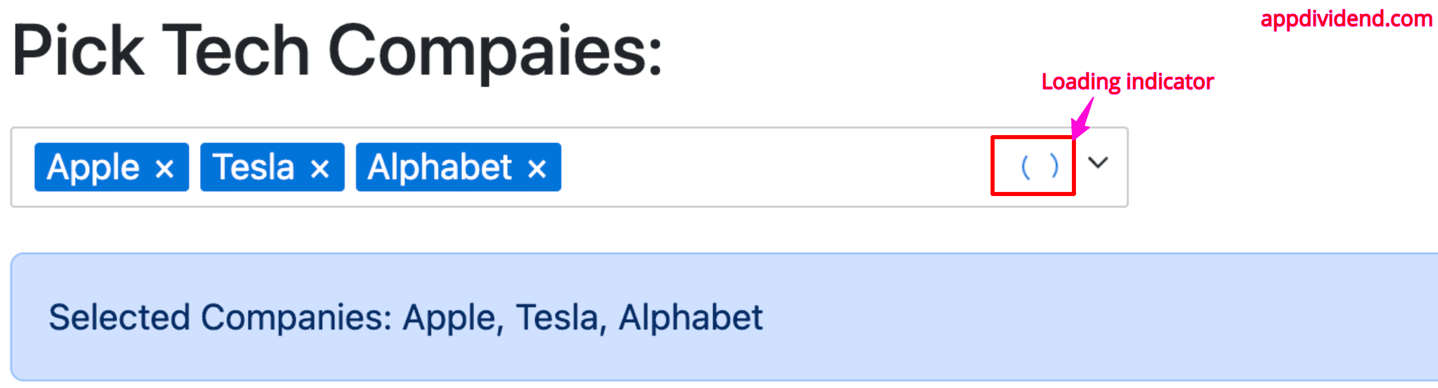
Passing loading indicator
You can add a loading indicator by passing “loading = true” like this:
<Dropdown
        options={techCompanies}
        values={selected}
        onChange={handleSelect}
        style={{ width: '500px', marginBottom: '20px' }}
        searchable={true}
        multi={true}
        loading={true}
/>
Output
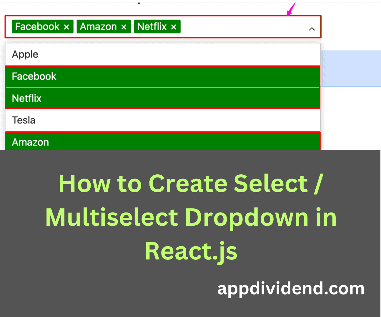
Setting a color
You can set a base color for the Dropdown component by passing the “color” property to this component.
<Dropdown
        options={techCompanies}
        values={selected}
        onChange={handleSelect}
        style={{ width: '500px', marginBottom: '20px' }}
        searchable={true}
        multi={true}
        color="green"
/>
Output

That’s it. We covered all the essential properties related to the Dropdown component.

Sajjad Ahmad
How do I get the selected value?
Suppose I want to log the selected value , how do i do that?