
Angular Datepicker is a built-in material component that allows users to enter the date through text input or by choosing the date from a calendar. It comprises several components and directives that work together.
Here is the step-by-step guide:
Step 1: Setup Angular 18
You can create a new Angular project using the below command:
ng new datepicker-app
Go inside the project:
cd datepicker-app
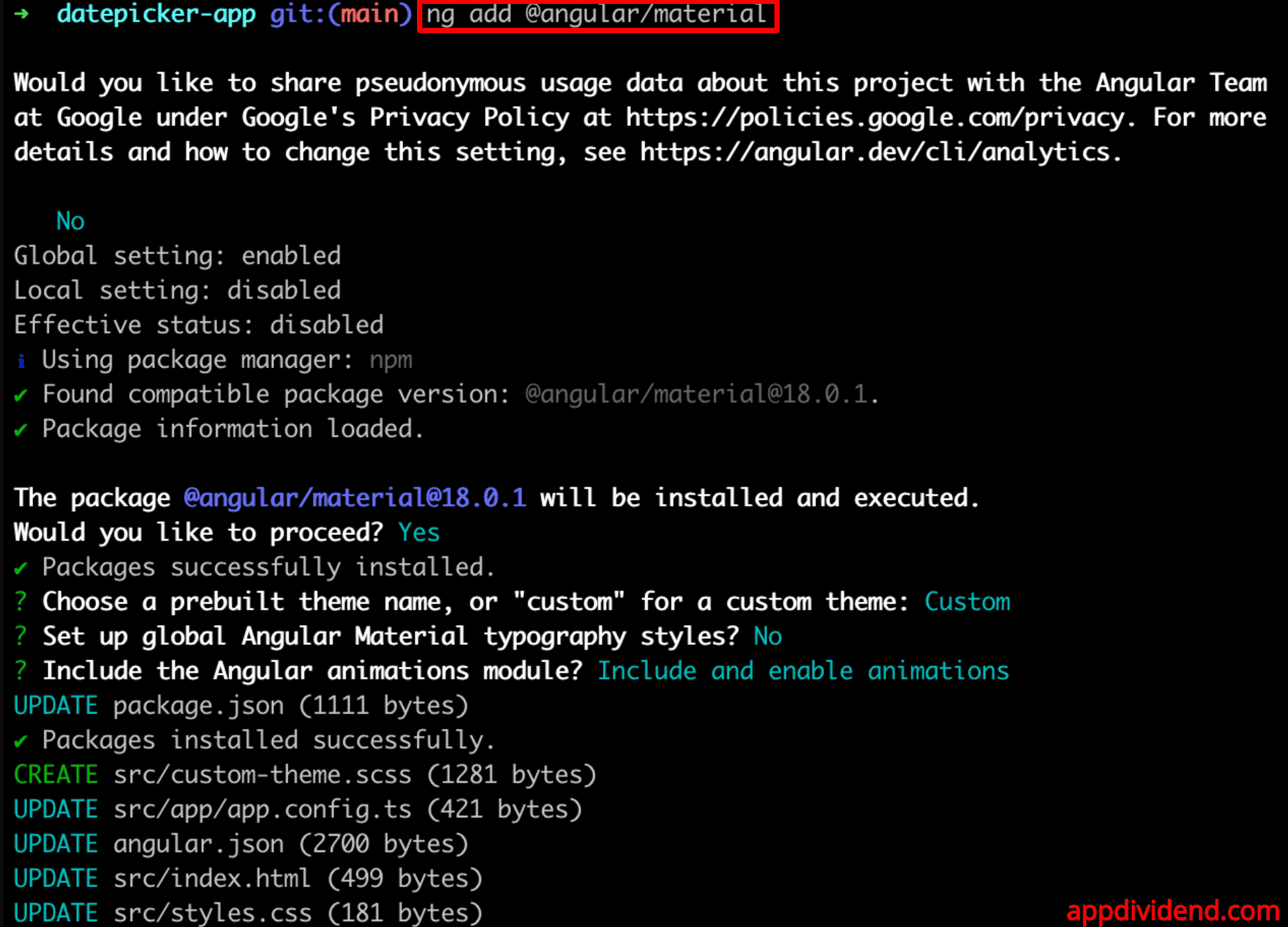
Step 2: Install Angular Material
To install the Angular Material 18, use the below command:
ng add @angular/material
Step 3: Import Angular Material Modules
We will import the necessary Angular Material modules in the src/app/app.component.ts file.
For the Datepicker, we need the MatDatepickerModule, MatNativeDateModule, and optionally, MatFormFieldModule and MatInputModule for styling the input field.
// app.component.ts

import { Component } from '@angular/core';
import { RouterOutlet } from '@angular/router';

import { MatDatepickerModule } from '@angular/material/datepicker';
import { MatNativeDateModule } from '@angular/material/core';
import { MatFormFieldModule } from '@angular/material/form-field';
import { MatInputModule } from '@angular/material/input';

@Component({
  selector: 'app-root',
  standalone: true,
  imports: [
    RouterOutlet,
    MatDatepickerModule,
    MatNativeDateModule,
    MatFormFieldModule,
    MatInputModule,
  ],
  templateUrl: './app.component.html',
  styleUrl: './app.component.css',
})

export class AppComponent {}
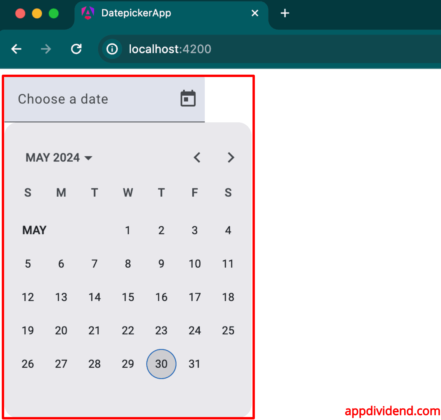
Step 4: Add the Datepicker Component in HTML
Replace the src/app/app.component.html code with the below code:
<mat-form-field appearance="fill">
  <mat-label>Choose a date</mat-label>
  <input matInput [matDatepicker]="picker" />
  <mat-datepicker-toggle matSuffix [for]="picker"></mat-datepicker-toggle>
  <mat-datepicker #picker></mat-datepicker>
</mat-form-field>
Save the file, go to the terminal, and start the development server using this command:
ng serve --open
It will up open the browser and navigate to this URL: http://localhost:4200/
Customize the Datepicker
Setting Minimum and Maximum Dates
Let’s set the minimum date as 1st Jan 2024 and the maximum date as 31st May 2024.
Add the below code to the app.component.ts file:
export class AppComponent {
  minDate = new Date(2024, 0, 1); // January 1, 2024
  maxDate = new Date(2024, 4, 31); // May 31, 2024
}
Modify the src/app/app.component.html file like this:
<mat-form-field>
  <input matInput [matDatepicker]="picker" placeholder="Choose a date" [min]="minDate"     [max]="maxDate">
  <mat-datepicker-toggle matSuffix [for]="picker"></mat-datepicker-toggle>
  <mat-datepicker #picker></mat-datepicker>
</mat-form-field>

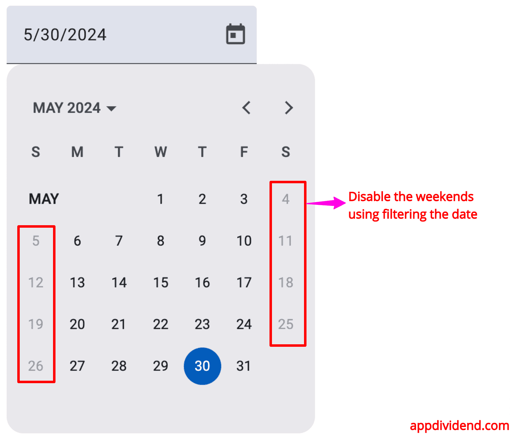
Date Filter
You can restrict the selectable dates to specific days (e.g., weekdays only) and disable weekends.
To add a filter to material datepicker, use the matDatepickerFilter property.
To do that, we will define a filter function called myFilter() function inside the src/app/app.component.ts file:
// app.component.ts

import { Component } from '@angular/core';
import { RouterOutlet } from '@angular/router';

import { MatDatepickerModule } from '@angular/material/datepicker';
import { MatNativeDateModule } from '@angular/material/core';
import { MatFormFieldModule } from '@angular/material/form-field';
import { MatInputModule } from '@angular/material/input';

@Component({
  selector: 'app-root',
  standalone: true,
  imports: [
    RouterOutlet,
    MatDatepickerModule,
    MatNativeDateModule,
    MatFormFieldModule,
    MatInputModule,
  ],
  templateUrl: './app.component.html',
  styleUrl: './app.component.css',
})

export class AppComponent {
    myFilter = (d: Date | null): boolean => {
    const day = (d || new Date()).getDay();
    // Prevent Saturday and Sunday from being selected.
    return day !== 0 && day !== 6;
  }
}
And here is the src/app/app.component.html file:
<mat-form-field>
  <input
    matInput
    [matDatepicker]="picker"
    placeholder="Choose a date"
    [matDatepickerFilter]="myFilter"
  />
  <mat-datepicker-toggle matSuffix [for]="picker"></mat-datepicker-toggle>
  <mat-datepicker #picker></mat-datepicker>
</mat-form-field>
Here, you can see that we provided the [matDatepickerFilter] property and assigned the myFilter() function to it.
Change Date Format
To change the date format, provide a custom date adapter.
For example, to use the MomentDateAdapter
Type the following command to install it:
npm install @angular/material-moment-adapter moment
Now, import the MatMomentDateModule and modify the src/app/app.component.ts file with the below code:
// app.component.ts

import { Component } from '@angular/core';
import { RouterOutlet } from '@angular/router';

import { MatDatepickerModule } from '@angular/material/datepicker';
import {
  MatNativeDateModule,
  DateAdapter,
  MAT_DATE_FORMATS,
  MAT_DATE_LOCALE,
} from '@angular/material/core';

import { MatFormFieldModule } from '@angular/material/form-field';
import { MatInputModule } from '@angular/material/input';

import {
  MatMomentDateModule,
  MomentDateAdapter,
  MAT_MOMENT_DATE_ADAPTER_OPTIONS,
} from '@angular/material-moment-adapter';

export const MY_FORMATS = {
  parse: {
    dateInput: 'LL',
  },
  display: {
    dateInput: 'LL',
    monthYearLabel: 'MMM YYYY',
    dateA11yLabel: 'LL',
    monthYearA11yLabel: 'MMMM YYYY',
  },
};

@Component({
  selector: 'app-root',
  standalone: true,
  imports: [
    RouterOutlet,
    MatDatepickerModule,
    MatNativeDateModule,
    MatFormFieldModule,
    MatInputModule,
    MatMomentDateModule,
  ],
  templateUrl: './app.component.html',
  styleUrls: ['./app.component.css'],
  providers: [
    { provide: MAT_DATE_LOCALE, useValue: 'en-GB' },
    { provide: MAT_DATE_FORMATS, useValue: MY_FORMATS },
    {
      provide: DateAdapter,
      useClass: MomentDateAdapter,
      deps: [MAT_DATE_LOCALE, MAT_MOMENT_DATE_ADAPTER_OPTIONS],
    },
  ],
})

export class AppComponent {
  minDate: Date;
  maxDate: Date;

  constructor() {
    this.minDate = new Date();
    this.maxDate = new Date();
    this.maxDate.setMonth(this.maxDate.getMonth() + 1); // 1 month from today
  }
}
And here is the modified src/app/app.component.html file:
<mat-form-field appearance="fill">
  <mat-label>Choose a date</mat-label>
  <input matInput [matDatepicker]="picker" [min]="minDate" [max]="maxDate" />
  <mat-datepicker-toggle matSuffix [for]="picker"></mat-datepicker-toggle>
  <mat-datepicker #picker></mat-datepicker>
</mat-form-field>

That’s it!

Aditya
Hi ,
can you tell me hot to set the date format to yyyy/mm/dd
Brahmani
I’m using mat-datepicker and I need to select only month and year from the date picker, is there any solution??
Zippy
What is it with Angular?
“How do I add a date picker?”, something that in Dot Net involves a single line of code with the behaviour and variables related to that object created automatically, but every tutorial I have seen on every control in Angular so far starts with instructions on how to create a project from scratch but here in order to implement it I need to create a material module to determine what it looks like?
Why does adding a single control seem to involve 10-20 lines of code no matter what one does?
Bare bones….minimum coding…just a date time picker…nothing else.
Sagar
TS2305: Module ‘”@angular/material”‘ has no exported member ‘MatDatepickerModule’.