
To implement a material radio button in Angular, you can use the <mat-radio-button> component. The <mat-radio-button> component provides the same functionality as a native <input type=”radio”> enhanced with Material Design styling and animations.
Radio-button label
The radio-button label is provided as the content of the <mat-radio-button> element. The label can be positioned before or after a radio button by setting a labelPosition property to ‘before’ or ‘after‘.
If you don’t need the label to appear next to the radio button, you can use the aria-label or aria-labeled to specify an appropriate label.
Radio groups
Radio buttons should typically be placed inside the <mat-radio-group> unless the DOM structure would make that impossible (e.g., radio buttons inside table cells).
The radio group has the value property that reflects the currently selected radio button inside the group.
Individual radio buttons inside the radio group will inherit the group’s name.
The <mat-radio-group> is compatible with @angular/forms and supports FormsModule and ReactiveFormsModule.
Here is the step-by-step guide to implementing a Material Radio Button in Angular:
Step 1: Setup an Angular project
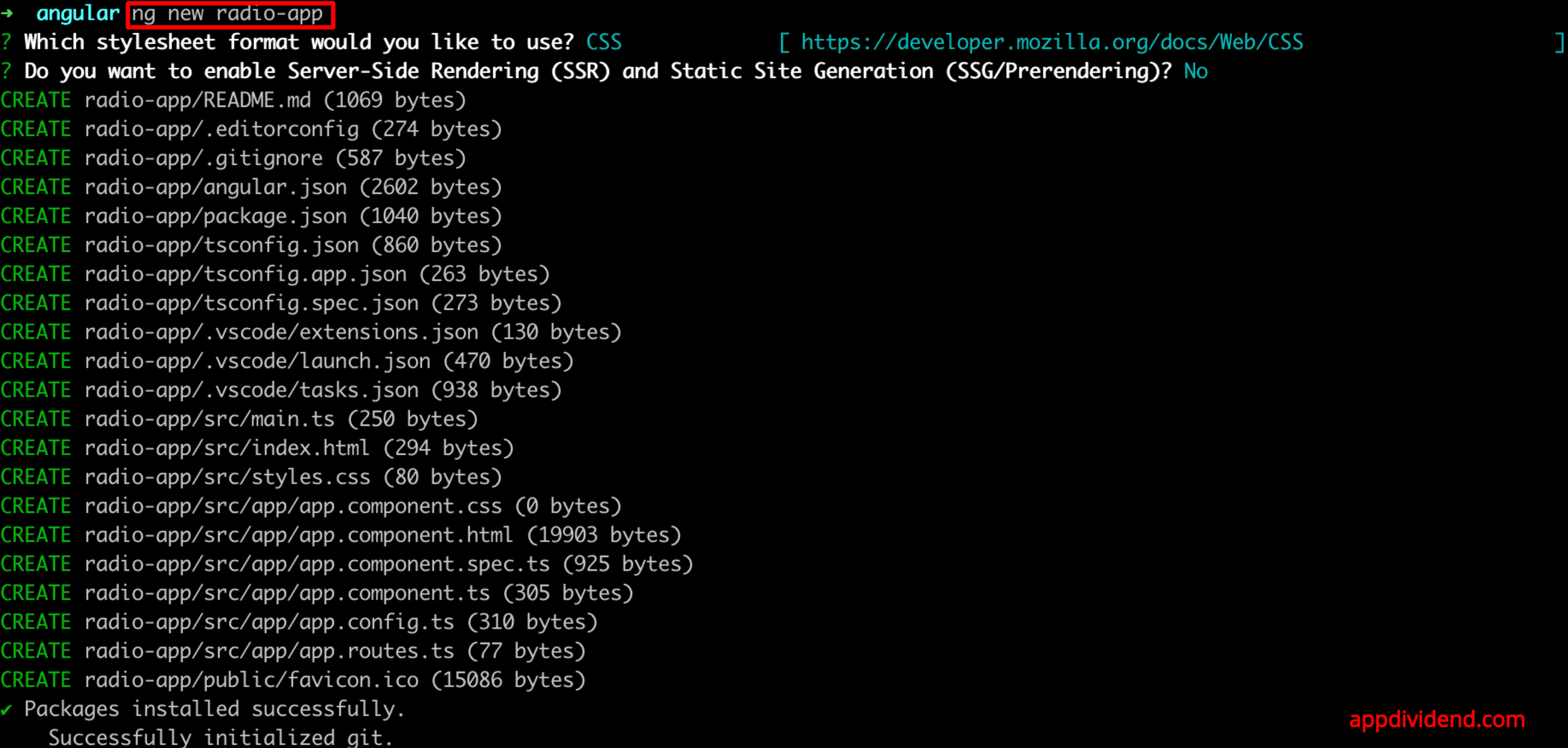
Create a new Angular project using Angular CLI using the below command:
ng new radio-app
Go inside the project.
cd radio-app
Step 2: Install Angular Material
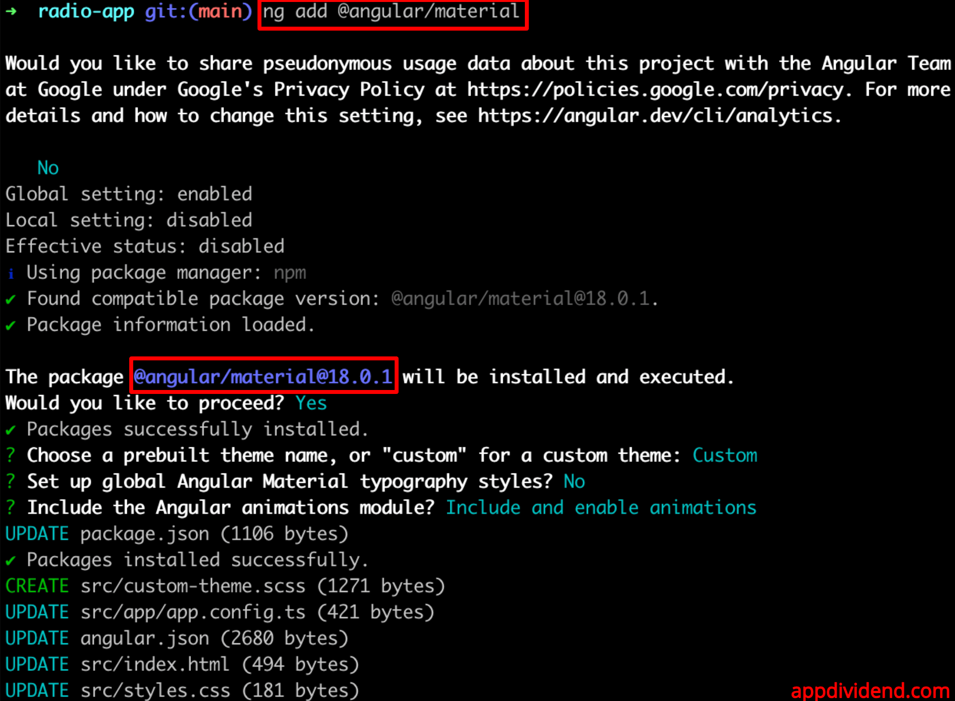
Installing Angular 18 Material using the below command:
ng add @angular/material
Step 3: Import Material Modules
Open the src/app/app.component.ts file and import MatRadioModule, CommonModule, and FormsModule.
// app.component.ts

import { Component } from '@angular/core';
import { RouterOutlet } from '@angular/router';
import { MatRadioModule } from '@angular/material/radio';
import { CommonModule } from '@angular/common';
import { FormsModule } from '@angular/forms';

@Component({
  selector: 'app-root',
  standalone: true,
  imports: [RouterOutlet, MatRadioModule, CommonModule, FormsModule],
  templateUrl: './app.component.html',
  styleUrl: './app.component.css',
})
export class AppComponent {

}
Step 4: Setup component logic
In the src/app/app.component.ts file, we need to define two variables:
- selectedOption: The user will select this option from different options, and it is a string.
- options: It is an array of options that we will display on the radio button. It can be static or dynamic.
Here is the complete code for the src/app/app.component.ts file:
import { Component } from '@angular/core';
import { RouterOutlet } from '@angular/router';
import { MatRadioModule } from '@angular/material/radio';
import { CommonModule } from '@angular/common';
import { FormsModule } from '@angular/forms';

@Component({
  selector: 'app-root',
  standalone: true,
  imports: [RouterOutlet, MatRadioModule, CommonModule, FormsModule],
  templateUrl: './app.component.html',
  styleUrl: './app.component.css',
})
export class AppComponent {
  selectedOption: string;
  options: string[] = ['Option 1', 'Option 2', 'Option 3'];

  constructor() {
    this.selectedOption = this.options[0];
  }
}
Step 5: Add Radio Buttons to the Template
We imported MatRadioModule, and now we will implement the HTML component inside the src/app/app.component.html file:
<h3>Select an option:</h3>
<mat-radio-group [(ngModel)]="selectedOption" aria-label="Select an option">
  <mat-radio-button *ngFor="let option of options" [value]="option">
    {{ option }}
  </mat-radio-button>
</mat-radio-group>
<p>You selected: {{ selectedOption }}</p>
So, in this code, when a user selects any option from the radio buttons, we will display the value of the specific option.
Step 6: Running the application
You can run the Angular 18 application using the below command:
ng serve --open

You can see that when the user selects the “Option 2” radio button, beneath, we displayed Option 2.
