

Sass is a CSS pre-processor, and Sass files are executed on the server and send CSS to the browser.
To style a React application using Sass, create a Sass file the same way you create CSS files, but Sass files have the file extension .scss and import the Sass file the same way you imported a CSS file.
You have to do nothing if you create a new React project using Vite frontend tooling. You can import SCSS files like CSS files, which will work fine.
Let’s see how to integrate Sass in React.js using Vite.
Step 1: Create a new React.js project
Type the following command to create a new React boilerplate:
npm create vite@latest sass-app -- --template react
Go inside the project and install the dependencies:
cd sass-app

npm install
Step 2: Install Sass
You can install Sass in your project using this command:
npm install sass
Understanding Sass file Structure
We will generally organize a Sass file structure. In this project, we will have global styles and component-related styles. Our basic SCSS file structure looks like this:
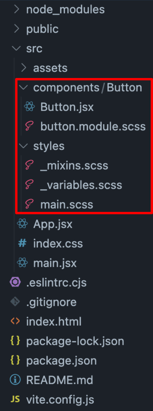
src/
|-- components/
|   |-- Button/
|   |   |-- Button.jsx
|   |   |-- button.module.scss
|-- styles/
|   |-- main.scss
|   |-- _variables.scss
|   |-- _mixins.scss
In this directory structure, our main folder is src, where all the React components and styling reside.
Inside the “src” folder, we will have two folders:
- components
- styles
The components folder has different folders for each component, and inside the component folder(Button), we will have a Button.jsx component and its stylesheet in SCSS.
The styles folder is responsible for global styles for our project.
The _variables.scss file has variables for different colors.
The _mixins.scss file can be used to encapsulate styles that can be dropped into a single style rule, contain style rules that can be nested in other rules or included at the top level of the stylesheet, or modify variables.
The main.scss file is responsible for global styling.
Step 3: Creating Sass files
Inside the src folder, create the following two folders:
- styles
- components
Inside the styles folder, we will have three files:
- _variables.scss
- _mixins.scss
- main.scss
Our _variables.scss file looks like this:
$primary-color: #007bff;

$secondary-color: #6c757d;
Our _mixins.scss file looks like this:
// Flexbox centering
@mixin flex-center {
  display: flex;
  justify-content: center;
  align-items: center;
}

// Flexbox layout with direction
@mixin flex-layout($direction: row, $justify: flex-start, $align: stretch) {
  display: flex;
  flex-direction: $direction;
  justify-content: $justify;
  align-items: $align;
}
And finally, main.scss file looks like this:
body {
  font-family: "Arial", sans-serif;
  margin: 0;
  padding: 0;
  display: flex;
  justify-content: center;
  align-items: center;
  height: 100vh;
  background-color: #f4f4f4;
}

.app {
  text-align: center;
}
Inside the components folder, create a new folder called Button, which is an individual component, and inside that Button folder, create two new files:
- Button.jsx
- button.module.scss
The button.module.scss file contains all the styling related to the Button component.
Add the below code inside the button.module.scss file:
@import "../../styles/variables";
@import "../../styles/mixins";

.button {
  background-color: #007bff;
  color: white;
  padding: 10px 20px;
  border: none;
  border-radius: 5px;
  cursor: pointer;
  transition: background-color 0.3s;

  &:hover {
    background-color: darken($primary-color, 10%);
  }
}
For the Button component, we need to ensure that the types of props passed to a component are as expected, which can help prevent bugs and improve code readability and maintainability.
To include prop-types in your Button component to validate the children prop, install the prop-types library:
npm install prop-types
Now, add the below code inside the Button.jsx file:
import styles from "./button.module.scss";
import PropTypes from "prop-types";

function Button({ children }) {
  return <button className={styles.button}>{children}</button>;
}

Button.propTypes = {
  children: PropTypes.node.isRequired,
};

export default Button;
Now, our directory structure looks like this:
Step 4: Import main.scss inside main.jsx file
The global styling sass file src/styles/main.scss file should be imported inside src/main.jsx file.
Here is the main.jsx file:
import React from "react";
import ReactDOM from "react-dom/client";

import "./styles/main.scss";
import App from "./App";

ReactDOM.createRoot(document.getElementById("root")).render(
  <React.StrictMode>
    <App />
  </React.StrictMode>
);
Step 5: Import the Button component inside the App.jsx file
The last step is to integrate a Button.jsx component into the main application App.jsx file.
import Button from "./components/Button/Button";

function App() {
  return (
    <div className="app">
      <h1>Welcome to React with Vite and Sass!</h1>
      <Button>Click Me!</Button>
    </div>
  );
}

export default App;
Save the file and go to this URL: http://localhost:5173/

That’s it!

arjun
its not working
arjun
exclude: [/\.js$/, /\.html$/, /\.json$/, /\.scss$/,],
dont forget to exclude scss
sharrod
Hello where do you exclude?
Pawan
iTS working without even include “exclude: [/\.js$/, /\.html$/, /\.json$/, /\.scss$/,],”
Pawan
iTS working without even added”exclude: [/\.js$/, /\.html$/, /\.json$/, /\.scss$/,],”