

To create a material dropdown in Angular, use the <mat-select> form control.
Angular material provides <mat-select> form control for selecting a value from a set of options, similar to the native <select> element. You can read more about selects in the Material Design documentation.
The <mat-select> is designed to work inside of an <mat-form-field> element.
We can add options to the select by adding <mat-option> elements to the <mat-select>.
Each <mat-option> has a value property that can set the value that will be selected if a user chooses this option. In addition, the content of the <mat-option> will be shown to the user.
Here is the step-by-step guide:
Step 1: Setup a new project
If you have not installed Angular CLI, you can install it using the below command:
npm install -g @angular/cli
Now, you can create a new project using the below command:
ng new dropdown-app

cd dropdown-app
Step 2: Install Angular Material
You can add Material Design to your project using the below command:
ng add @angular/material
While installation, you will be prompted to choose a prebuilt theme. Select one based on your preference (e.g., Indigo/Pink or plain, just like I did).
Step 3: Create a dropdown component
You can generate a new angular component using this command:
ng generate component material-dropdown
Step 4: Add an HTML for Dropdown
Open src/app/material-dropdown/material-dropdown.component.html and add the following HTML code:
<form [formGroup]="form">
  <mat-form-field appearance="fill">
    <mat-label>Select an option</mat-label>
    <mat-select formControlName="selectedOption">
      <mat-option *ngFor="let option of options" [value]="option">
        {{ option }}
      </mat-option>
    </mat-select>
    <mat-error *ngIf="form.get('selectedOption')?.hasError('required')">
      Please select an option
    </mat-error>
  </mat-form-field>
</form>

<p>You selected: {{ selectedOption }}</p>
In this code, we used <mat-form-field>, <mat-label>, <mat-select>, <mat-option>, and <mat-error> elements from material library.
In the <mat-option> element, we iterated for loop using *ngFor to add the options or dropdown values.
The <mat-error> element displays the error if a user does not select any option value.
In the last line, we display the option the user selects from the dropdown.
Step 5: Add logic to handle dropdown options
Open src/app/material-dropdown/material-dropdown.component.ts and add the following TypeScript code:
import { Component, OnInit } from '@angular/core';
import { MatSelectModule } from '@angular/material/select';
import { MatFormFieldModule } from '@angular/material/form-field';
import { CommonModule } from '@angular/common';
import { FormBuilder, FormGroup, Validators } from '@angular/forms';
import { ReactiveFormsModule } from '@angular/forms';

@Component({
  selector: 'app-material-dropdown',
  standalone: true,
  imports: [
    MatSelectModule,
    MatFormFieldModule,
    CommonModule,
    ReactiveFormsModule,
  ],
  templateUrl: './material-dropdown.component.html',
  styleUrls: ['./material-dropdown.component.css'],
})
export class MaterialDropdownComponent implements OnInit {
  form!: FormGroup;
  options: string[] = ['', 'Option 1', 'Option 2', 'Option 3'];

  constructor(private fb: FormBuilder) {}

  ngOnInit(): void {
    this.form = this.fb.group({
      selectedOption: ['', Validators.required],
    });
  }

  get selectedOption() {
    return this.form.get('selectedOption')?.value || '';
  }
}
From the Angular core module, we imported the Component decorator and the OnInit lifecycle hook.
From the material module, we imported the select dropdown and form field controls.
From the common module, we imported CommonModule, which includes common directives like ngIf and ngFor.
From the forms module, we imported classes and interfaces for building and validating forms.
- FormBuilder helps construct form groups and controls.
- FormGroup represents a group of form controls
- Validators module provides built-in validators.
We declared a form property of type FormGroup.
The exclamation mark (!) is a TypeScript non-null assertion operator suggesting that the variable will be initialized later.
In the next step, we declared an options property which is an array of strings representing the options available in the dropdown.
We defined a constructor for the component, injecting the FormBuilder service as a private member.
Step 5: Register a Dropdown Component in the Main App
Update src/app/app.component.html to include the dropdown component like this:
<mat-grid-list cols="4" rowHeight="2:1">
  <mat-grid-tile>
    <app-material-dropdown></app-material-dropdown>
  </mat-grid-tile>
  <!-- Add more grid tiles as needed -->
</mat-grid-list>
And Update the src/app/app.component.ts file as well:
import { Component } from '@angular/core';
import { RouterOutlet } from '@angular/router';
import { MaterialDropdownComponent } from './material-dropdown/material-dropdown.component';
import { MatGridListModule } from '@angular/material/grid-list';

@Component({
  selector: 'app-root',
  standalone: true,
  imports: [RouterOutlet, MaterialDropdownComponent, MatGridListModule],
  templateUrl: './app.component.html',
  styleUrl: './app.component.css',
})

export class AppComponent {
  title = 'my-app';
}
Step 6: Run the Application
You can boot up the Angular application using the below command:
ng serve --open
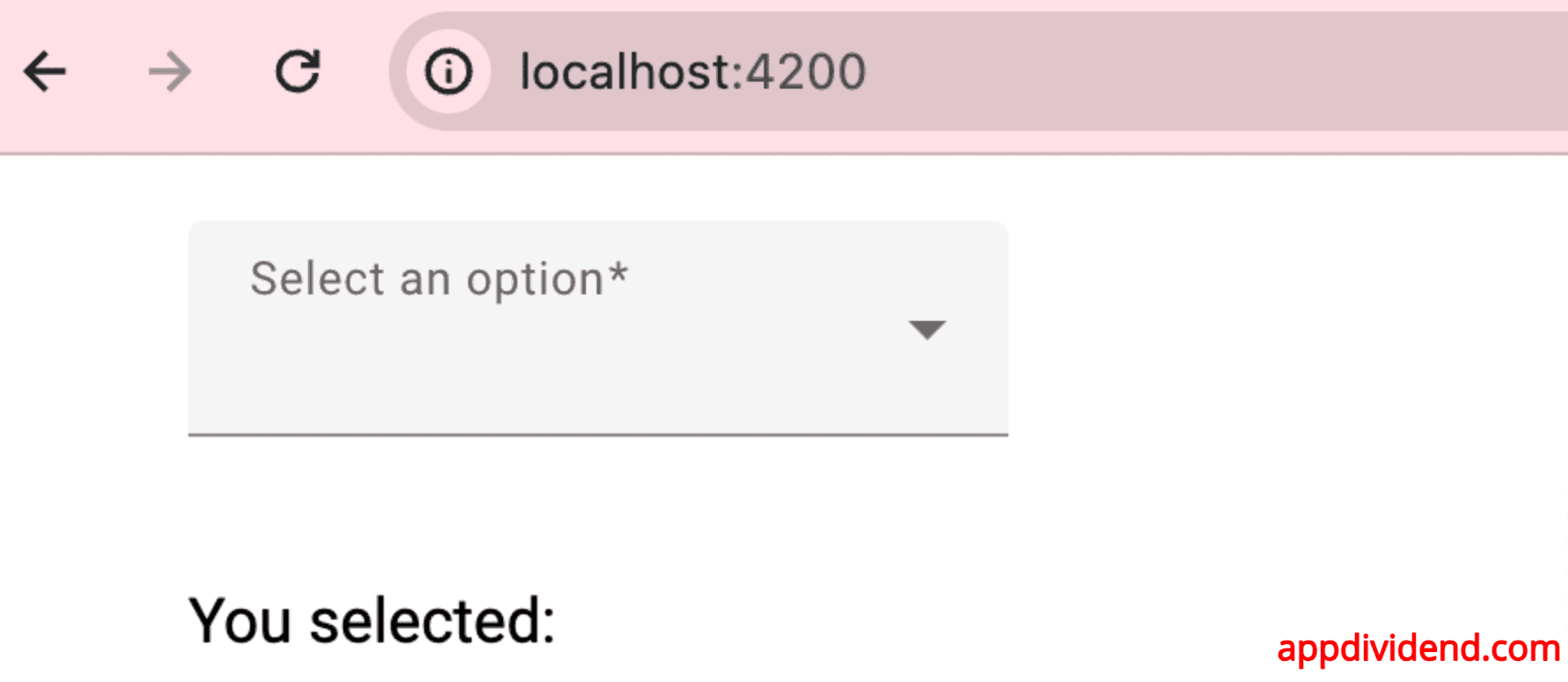
If you go to this URL: http://localhost:4200/
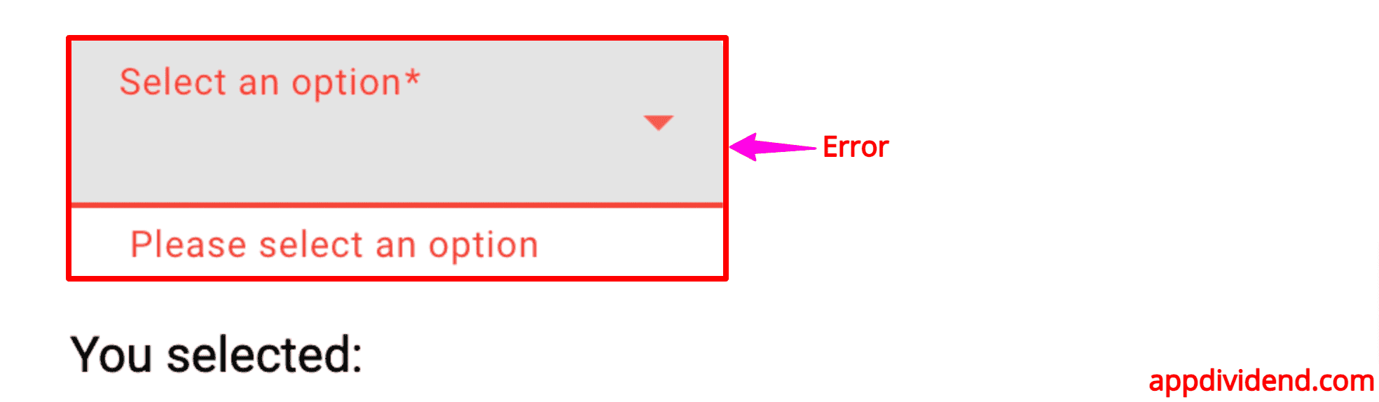
If you don’t select any value, you will see the error like this:
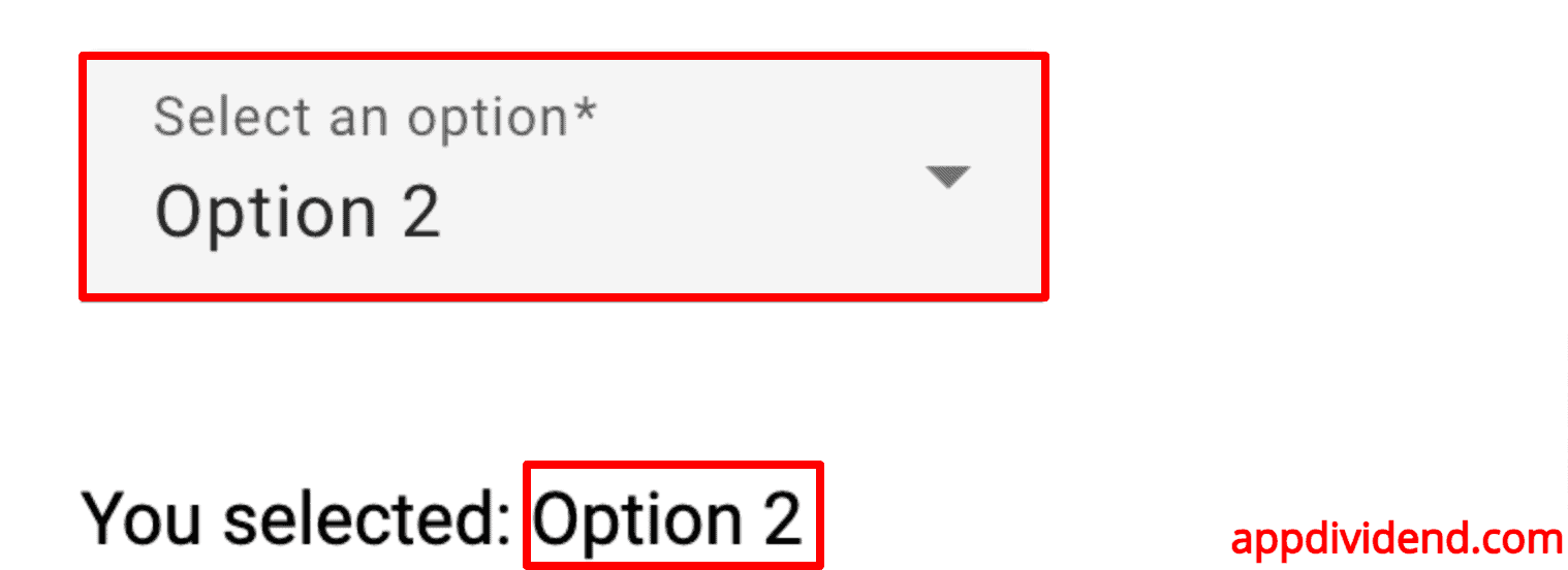
If you select any option, it will be displayed like this:
That’s all!